IBM Solution Gateway
Interned on ISG team, designed for sales and solutioning professionals in IBM
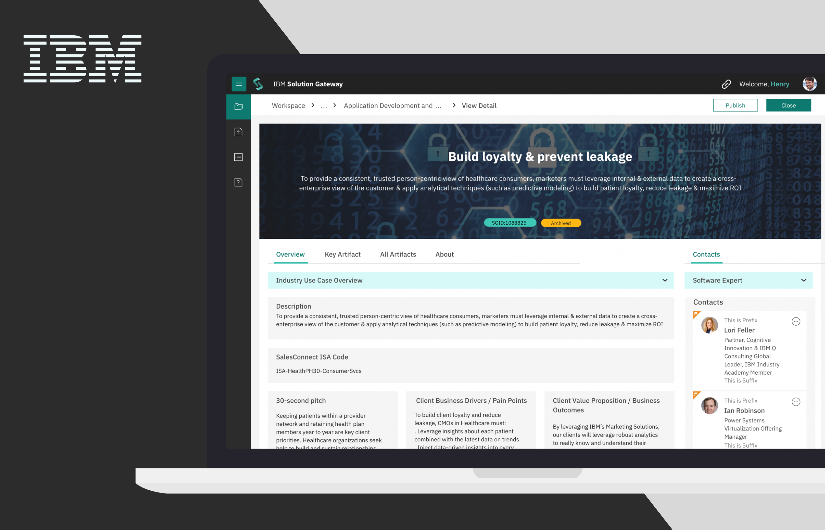
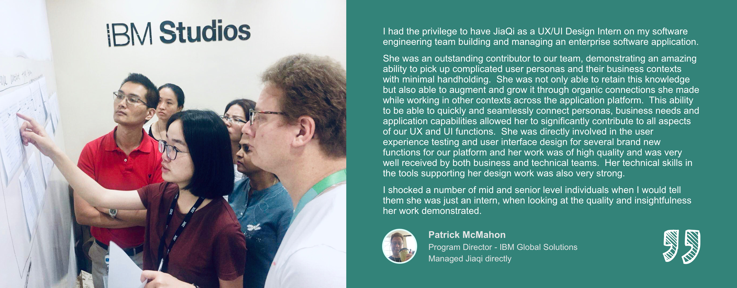
The past summer and fall semester I was a UX Design Intern at IBM Studios Shanghai. In the first four months (from 06/2018 to 09/2018), I interned on IBM Solution Gateway project - an internal asset sharing and management platform, designing for sales and solutioning professionals within IBM and working together with a global team.
During the time on ISG project,
Besides, I also had a chance to be fully involved in a 1-week Design Thinking Workshop in Shanghai. I communicated face-to-face with stakeholders and sponsor users not just discussing about current features but also envisioning the future of the platform.
I really learned a lot from this amazing journey and from people I worked with. This experience helped me realize how passionate I’m about being a designer solving problems and crafting delightful experience for our users, and now, I have a clearer vision of what kind of designer I want to be in the future.
Unfortunately, due to NDA, I’m not allowed to disclose the detailed interfaces of this IBM internal platform, even if this new version has been released internally. But I still would love to share some background information of the product I’ve worked on, the lessons I learned from doing design tasks, and the reflections I made on how to be a more professional designer.
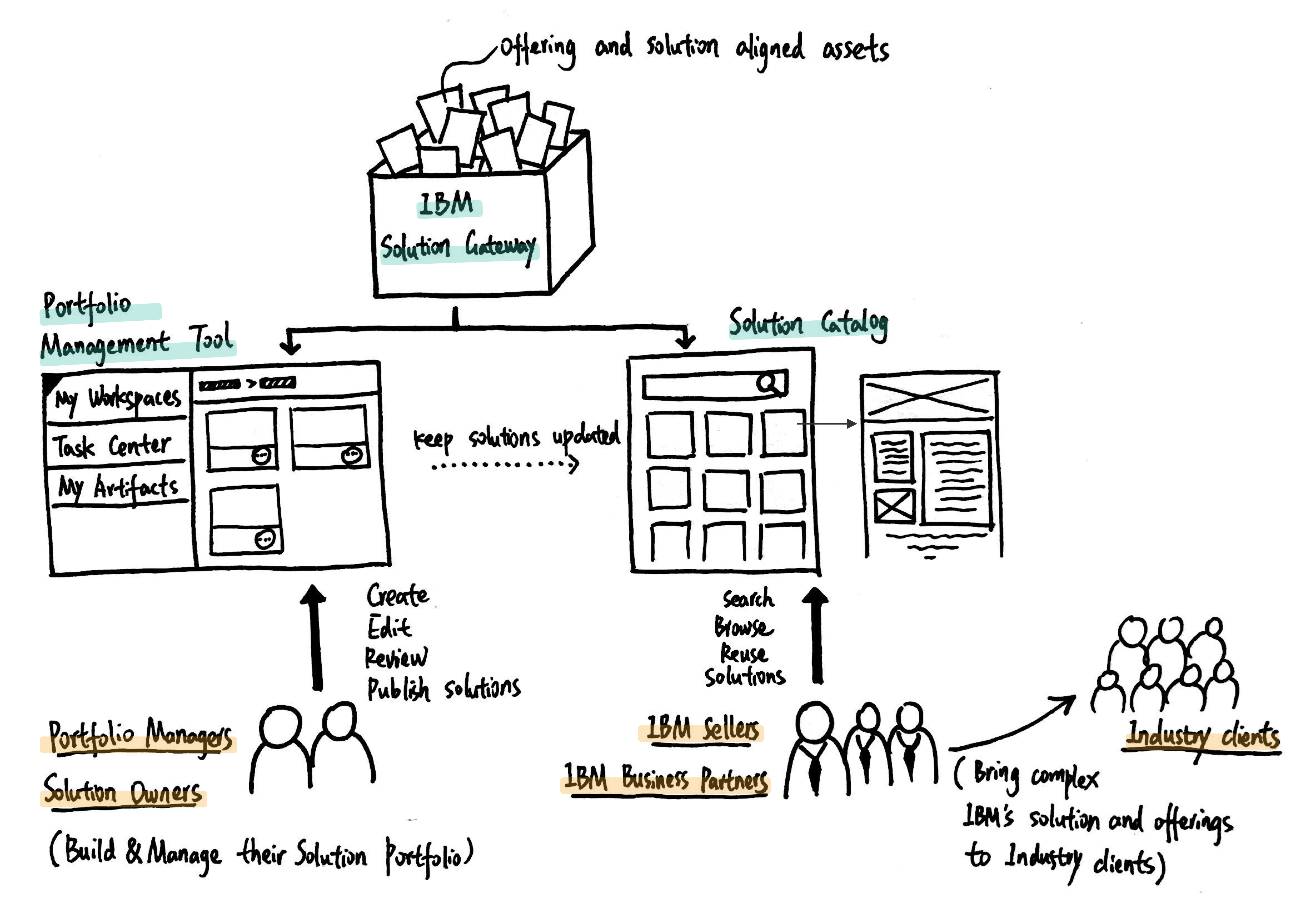
The IBM Solution Gateway (formerly called Asset Hub) is an actively managed environment providing the trusted source for Offering and Solution aligned assets. It includes the full lifecycle of sales, design and delivery artifacts as well as building blocks (code) and productivity tools, and can integrate easily into global and local community environments by providing the ability to deep link into specific views and exports of managed information to other tools.
The IBM Solution Gateway is consisted of two main parts: Portfolio Management Tool and Solution Catalog.
I joined the ISG Design team at the kickoff stage of a new release version - PMT Version Two Release Two (PMT V2R2, for short), and was fully involved in this project for 4 months - from 06/2018 to 09/2018.
During this release cycle, we mainly focus on the content management piece of Solution Gateway Platform - Portfolio Management Tool (PMT, for short), and the followings are the focus and scope of this phase:
The following is the recap of two design cases that are conducted mainly by me, and some takeaways I learned along the way.
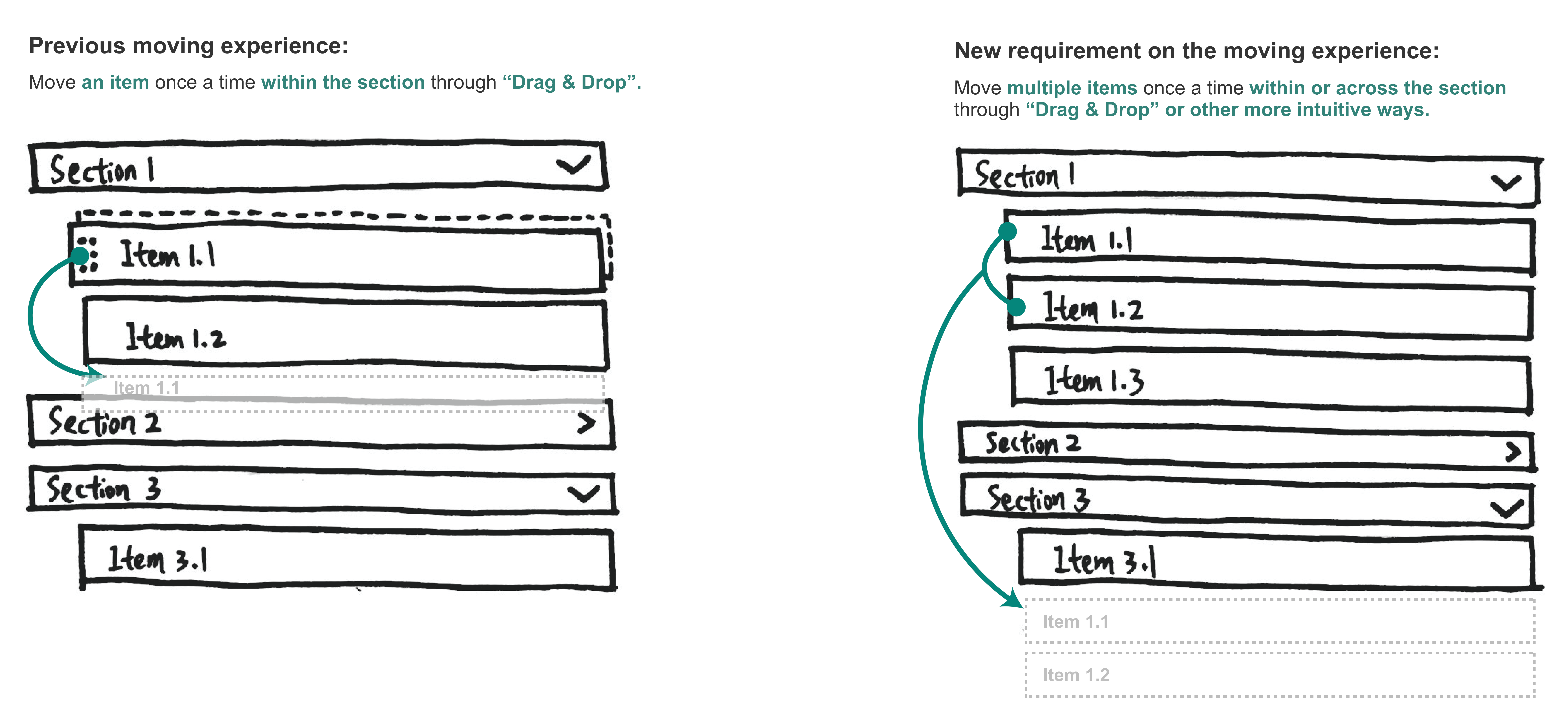
The existing “Moving” feature on the detail editing page only allow users to change the order of the items in the same section through “drag and drop”, and according to the new requirement we got from the product ownership team, we need to design a new “Moving” experience that also enable users to move one or multiple items from one section to another.
1. The lack of the context for this new requirement.
All the information I got for this task is a user story describing this new feature briefly from the business perspective. After reading it, I felt that I still didn’t know where to start with - I had hundreds of questions in my mind waiting to be answered, like “Why our users need this new feature”, “under what circumstance they are going to use it”, “what they currently do if they want move items to other section”… The answers for these questions will influence the design decisions of “how to initiate the moving action”, “how to select the items for the move”...
2. Find a proper approach of Moving for this new requirement
Previously, users can change the position of an item within the section through “Drag & Drop”. However, since now we would enable users to move items across the section, “Drag & Drop” may no longer be the best practice, because the position of the original section and the destination section can be very far away from each other. I need to come up with a new approach for this new “Moving” requirement that is both intuitive and consistent with the other “moving” experience on this platform.
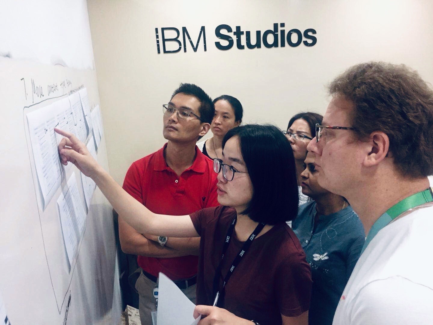
1. It’s important to understand the context of a new feature by asking questions and talking to the real users
As I mentioned before, I felt I was lack of the context of this task and didn’t know where to start. And because of the nature of this project, I had limited contact with end users at that stage. So by walking through the current Moving feature on the solution detail page and seeking advice from fellow designers and business analysts in the team, I sketched out some ideas based on the information I got.
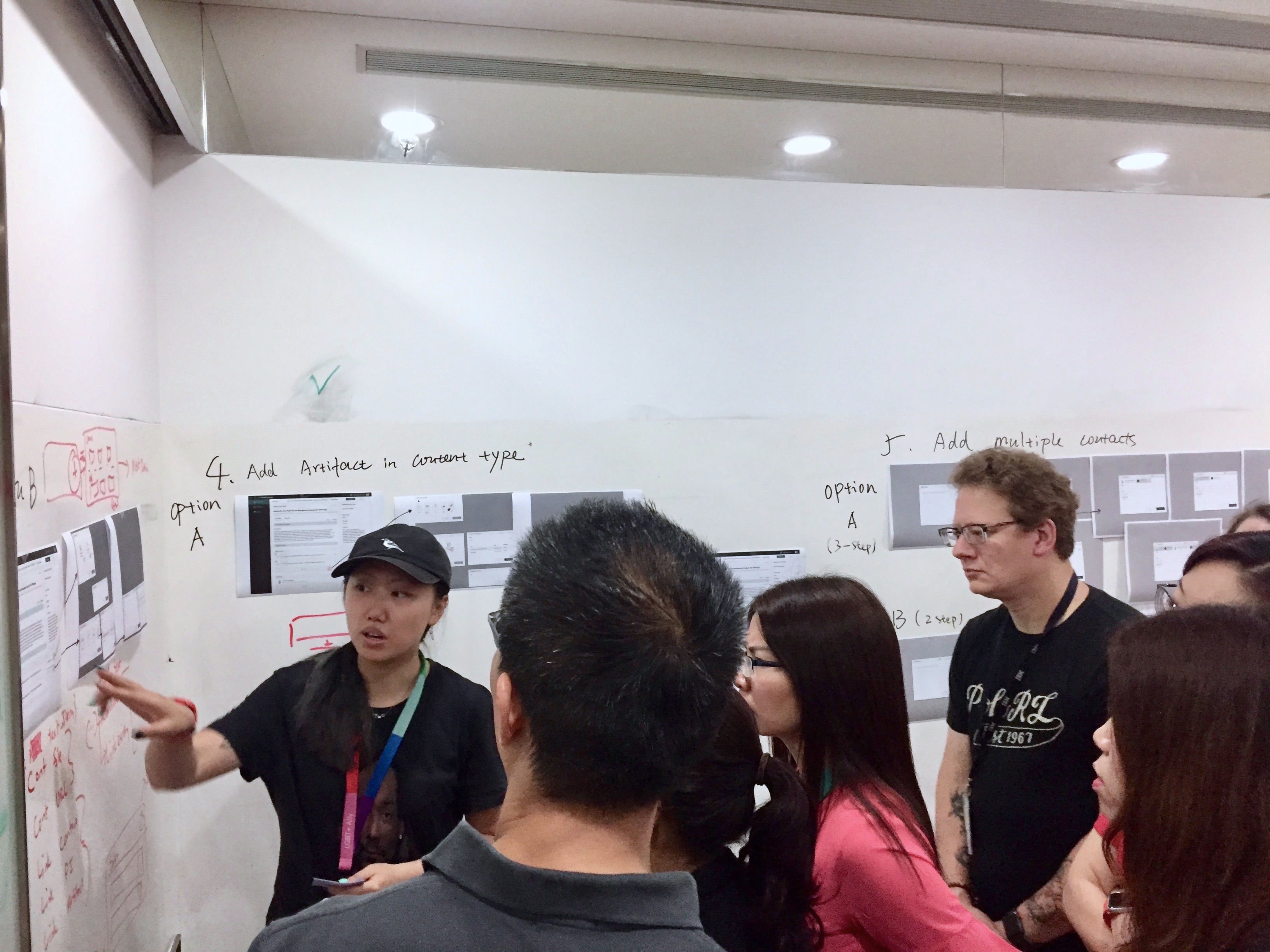
In the next week, during the Design Thinking Workshop in Shanghai Studio, our design team got chances to communicate with our stakeholders and sponsor users face to face. So, I printed out two different options of the new moving feature, showed them to the users and asked for their feedback.
What I found most valuable from this experience was actually not how users thought about my design proposals, but the reasons behind it and the more exciting thoughts triggered by what’s on the paper. By talking to users, I was educated about how they currently used the “Moving” feature, WHY they had the need to move multiple items to other section, what they liked or disliked about my proposal and WHY, what other expectations they had… After these informative talks, I iterated on the previous designs, and this time, I felt I’m confident on my design decisions and had better rationales to support them.
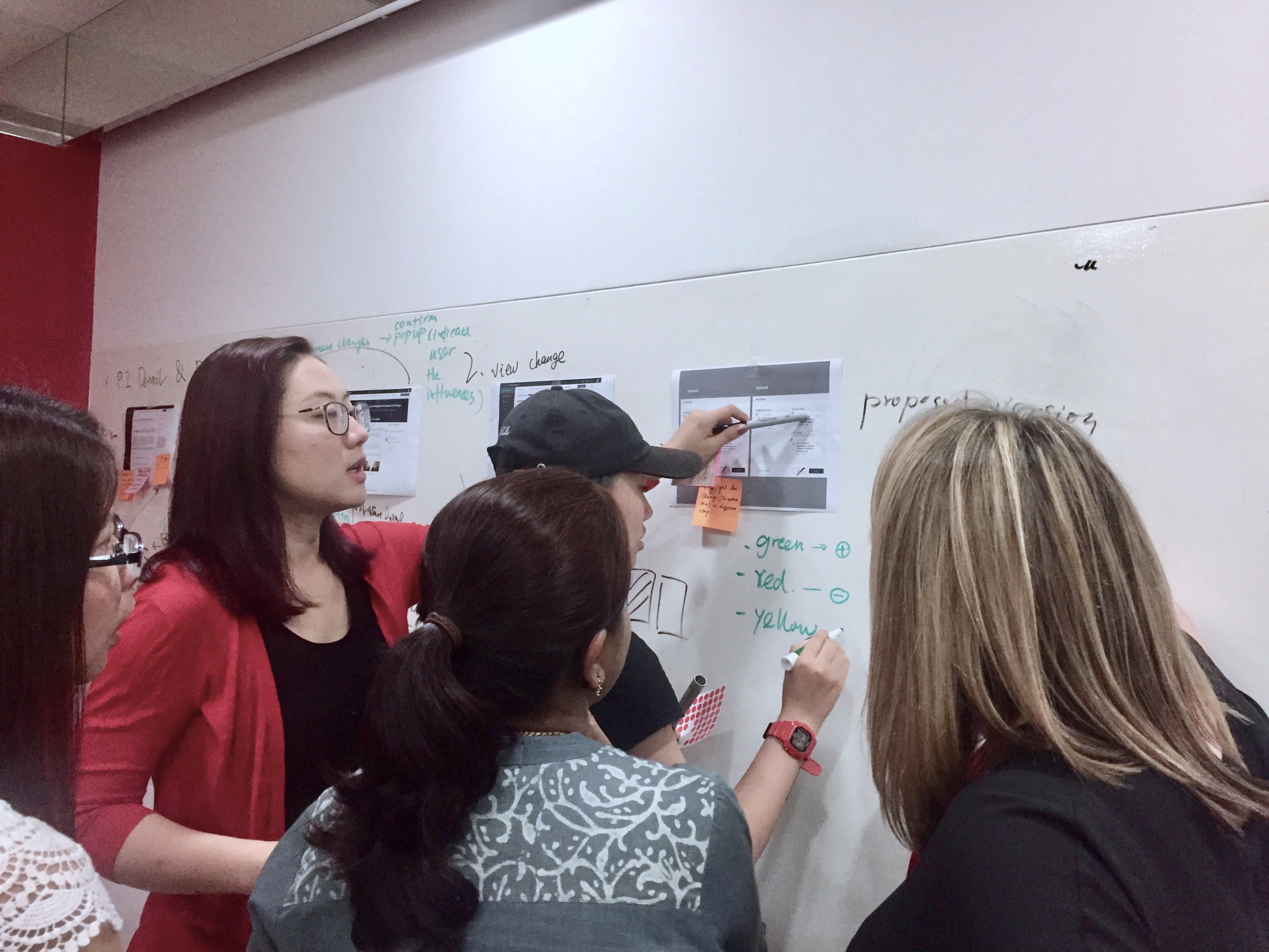
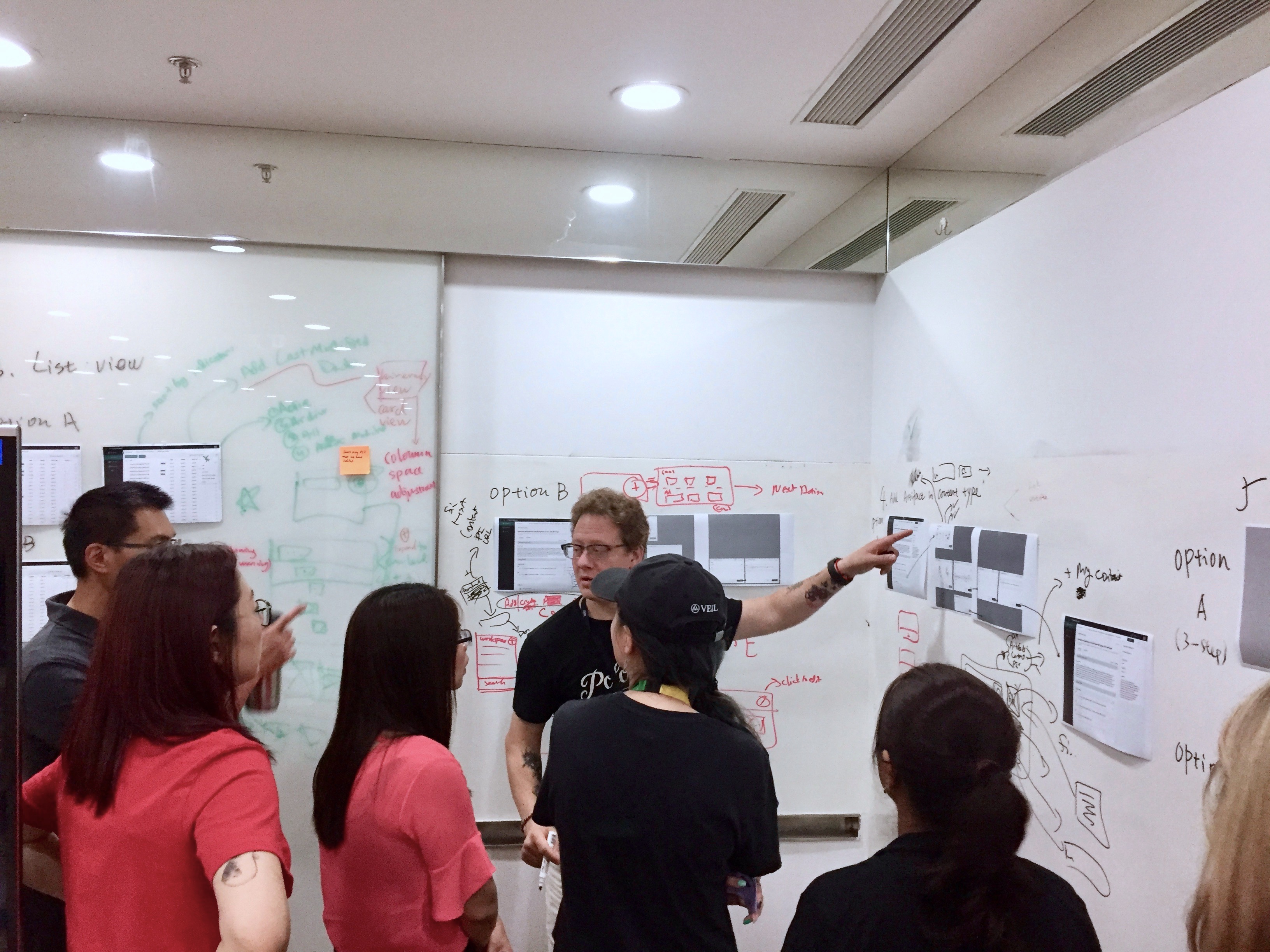
2. It’s important to get something tangible and move forward.
The ambiguity of the requirement was something scared me a lot when I first joined the team, and I always felt I needed more information to start doing design. However, I gradually realized that the ambiguity was so common in the real work setting, and I shouldn’t let it block my way of moving forward.
I learned to make assumptions based on what I’ve known and visualize my thoughts by sketching them out on paper or whiteboards, because I found that asking for feedback from users or critiques from design fellows by just describing ideas in my mind can be very misleading and meaningless -- I cannot make sure what others had in their mind was the same as the thing I tried to convey. On the contrary, showing users something tangible can make sure we are on the same page and also open up a conversation in which they would provide me tons of useful information and even participate in the design process with me.
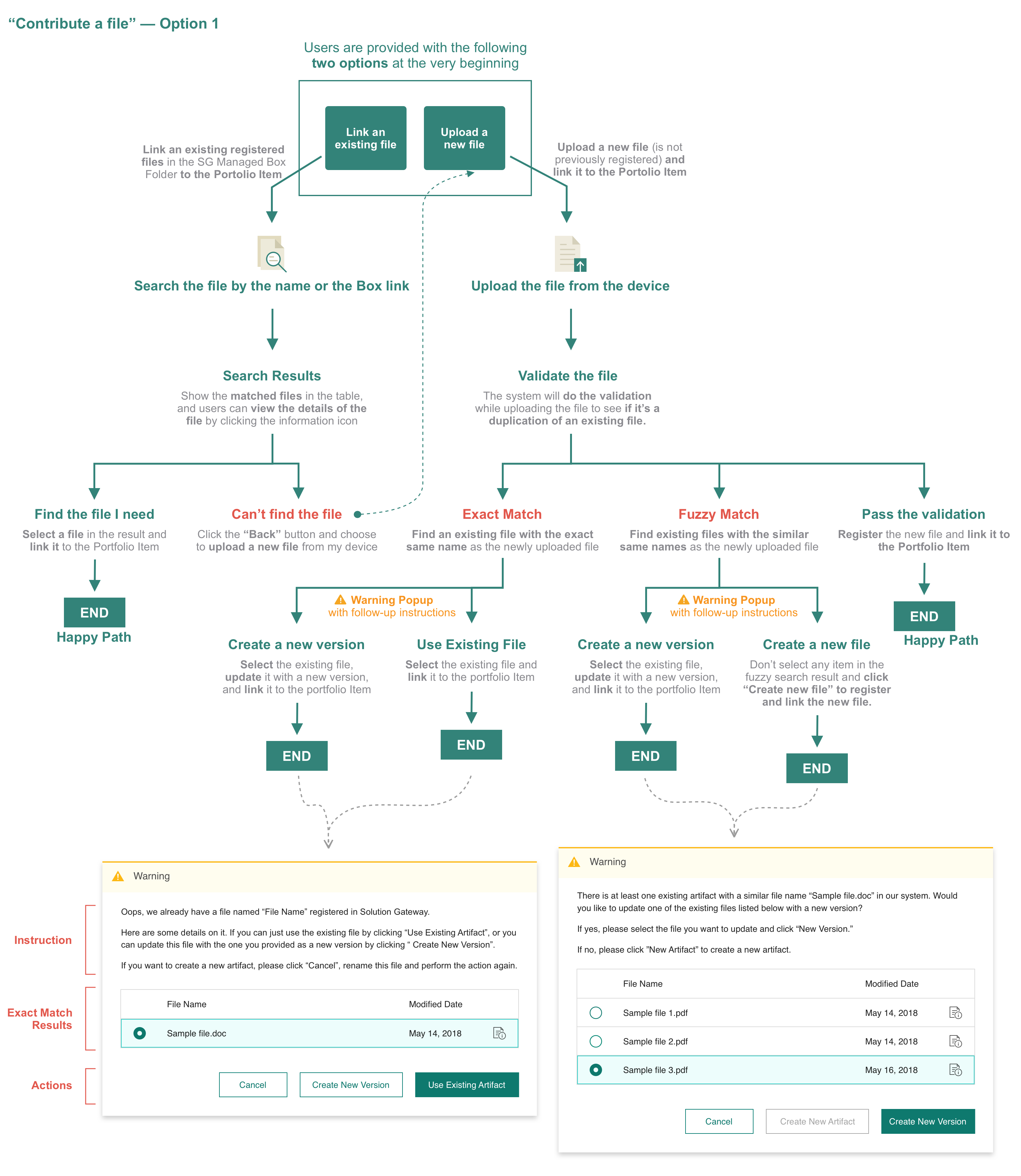
In the current experience, the system will just register the file uploaded by the user and link it to the Portfolio Item without doing the validation (see the Figure “the previous flow of contributing a file”). However, in order to avoid creating duplicate file registrations and to better organize the files in the SG Managed Box Folder, we decided to add the Validation step in the process. If some existing files with exact or similar names have been found, users need to take further actions according to the instruction provided (see the Figure “the revised flow of contributing a file”).

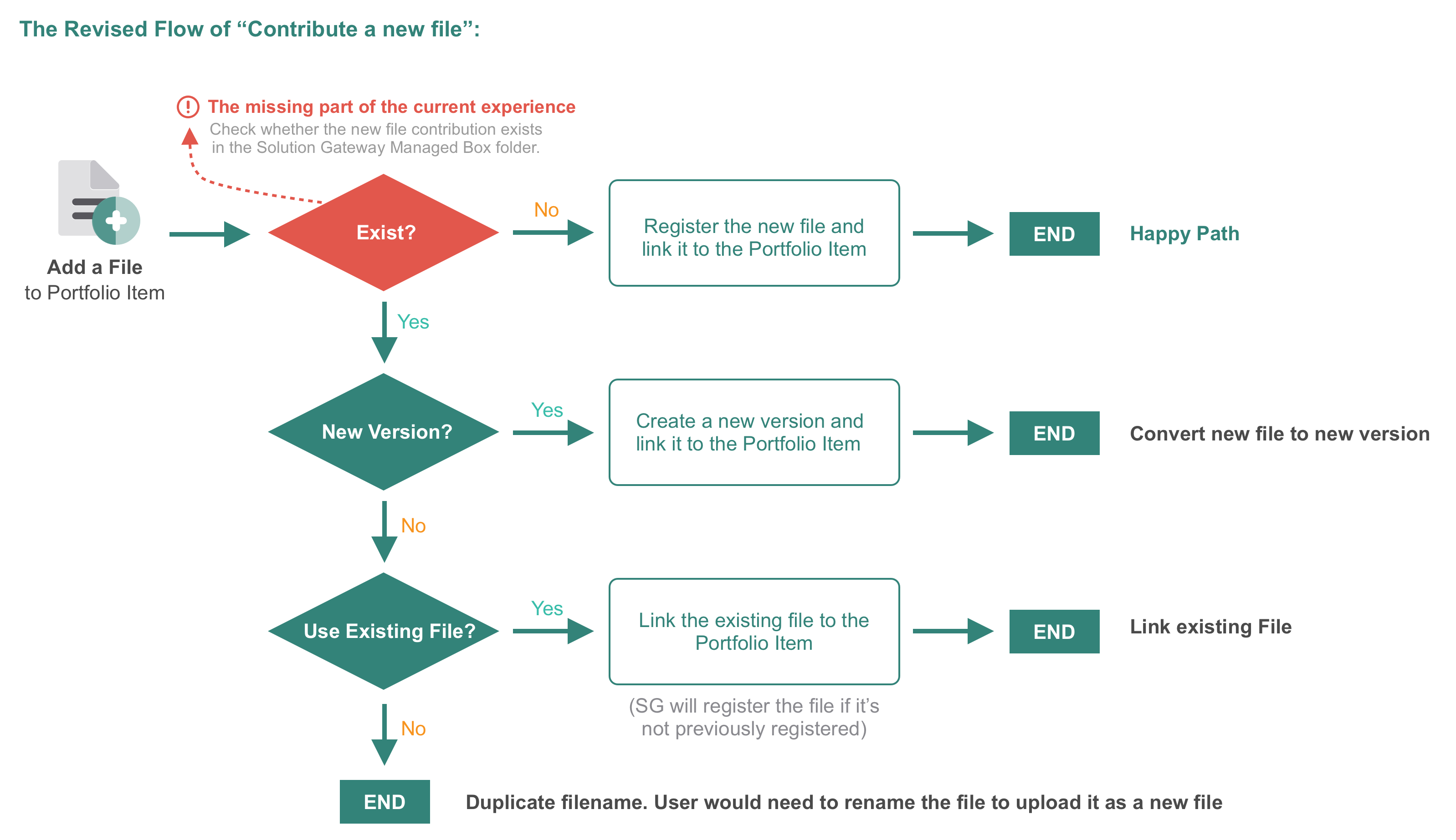
We came up with two design options for the new “contribute a file” experience and discussed about their pros and cons on the internal meeting with other stakeholders.
Because we built these two ideas from two of the most common user cases and they are both more suitable in their own cases, we had a difficult time to reaching an internal agreement on which option to choose.
We provided users with two ways of contributing a file:
This design option is very convenient for experienced users who have a clear idea about what’s already in the Box Folder and what’s not. They can do a quick search on their own and then decide whether they still want to upload the file. The task of contributing a file can be easily finished through Search-Select-Link or Upload-Validate-Register&Link (two happy paths). But if one way doesn’t work, they need to go back to the first step and choose another way as an alternative.
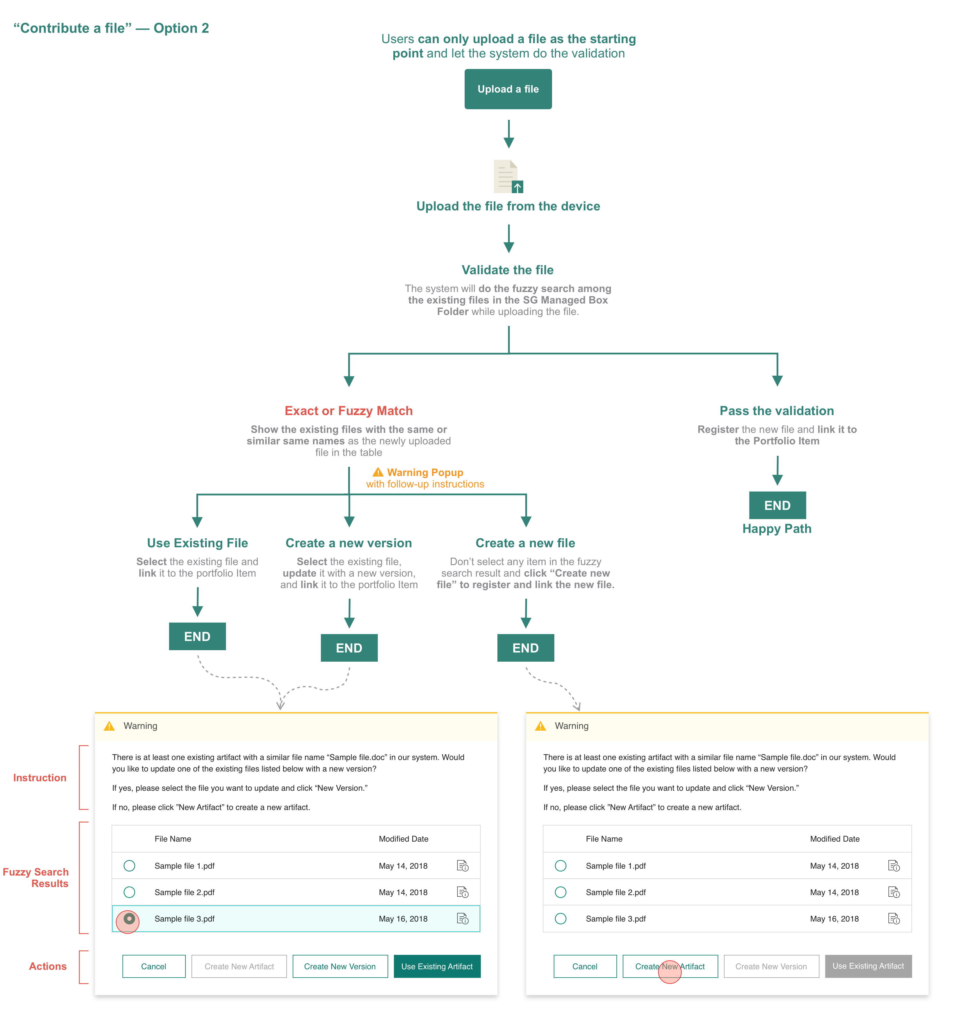
Simplify the experience by only allowing users to upload a file as the starting point and let the system tell what they need to after the validation.
This design option is more convenient for user who don’t know what they previously contributed/registered. The system will do the fuzzy search to find existing files with similar names as the newly uploaded file in the Box Folder. If some files are found, users will be provided with four options to continue the task:
But for the users who intend to link an existing file from the SG Managed Box Folder, there is no quick path for them to do so. And providing four option buttons on the warning popup (see the figure below) might be very confusing for the users - it’s difficult for them to distinguish among these four options with limited text information on the button.
1. The workflow with good logic is not equal to good user experience, and never make design decisions just based on our own assumptions about what users might think or do.
Both of the options I mentioned seem to have good logic, and the whole process seems to be “right”, but what we designed for our users is really what they expect or want?
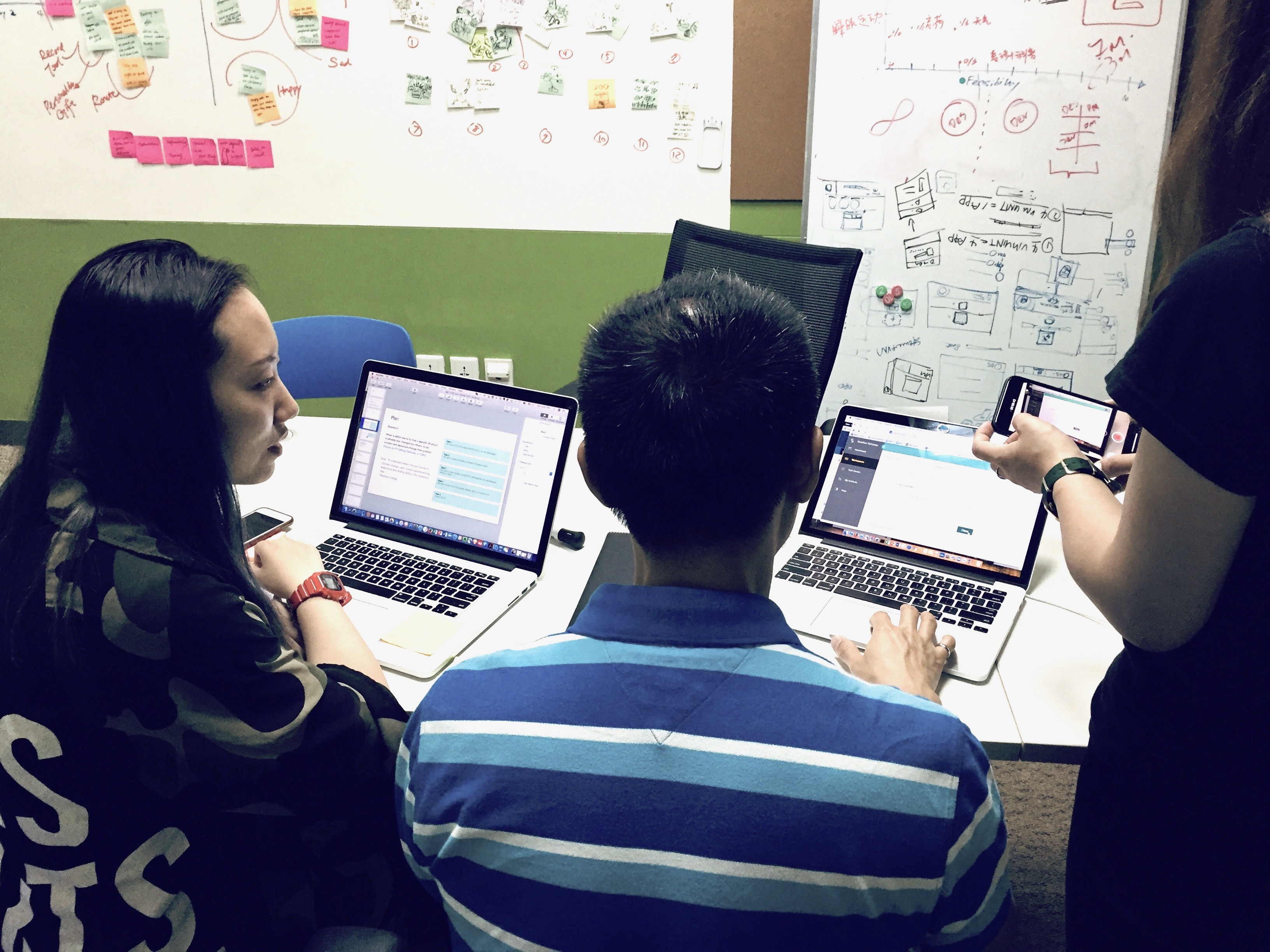
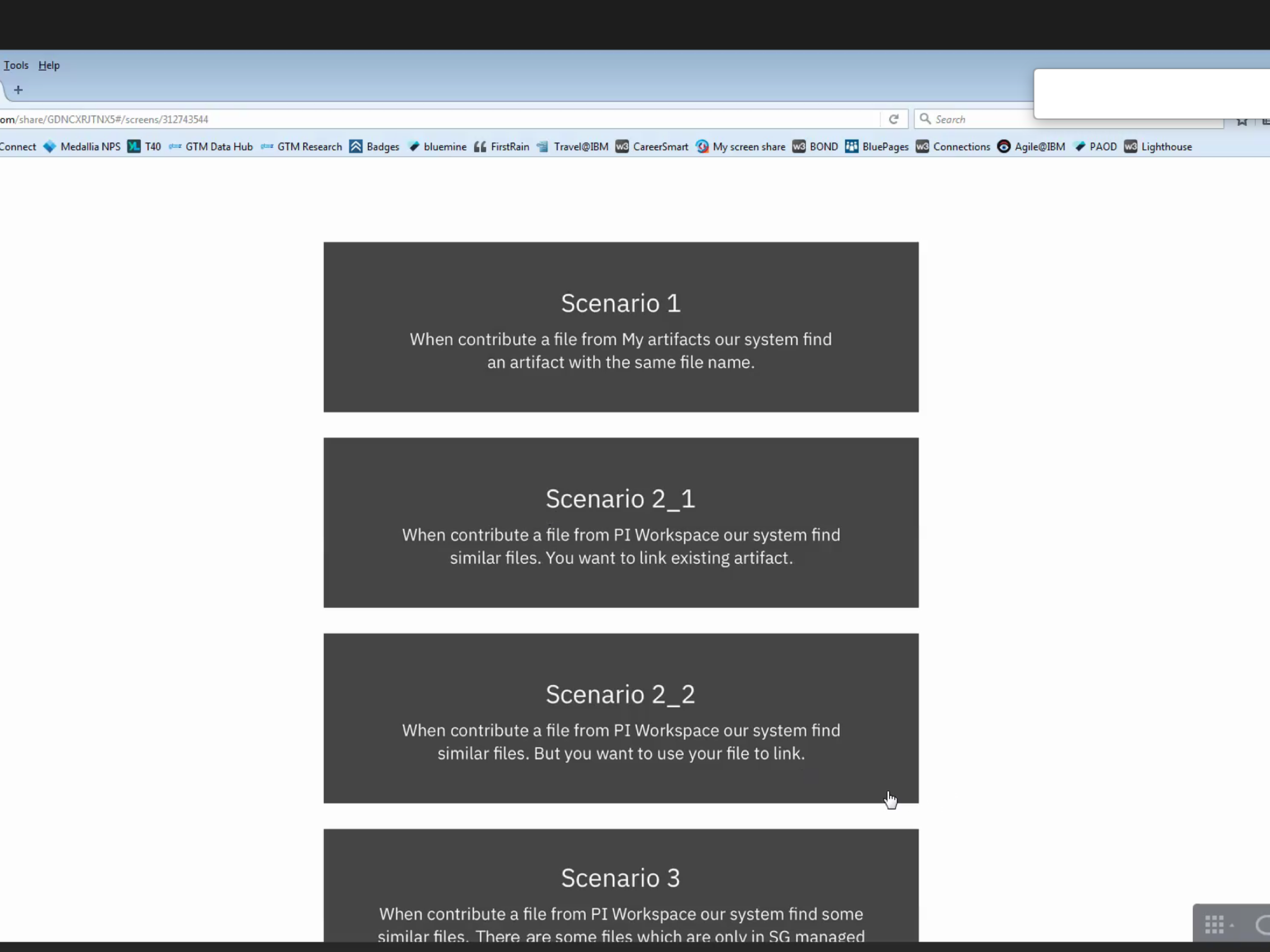
In order to figure out the question, we conducted A/B test on these two design options with 6 users and asked for their feedback. All the tested users stated that having the SG system search for similar files is valuable because they don't always know what they previously contributed/registered, but some of them mentioned that they would still prefer to search the file very quickly to see if it already exists in the Folder before they upload a file.
From this experience, I learned that a workflow with right logic doesn’t mean it’s a good experience for the users. For option 2, it has good logic and provides all the possible routes for the users, but there is no quick path for one of the most common cases (link an existing file), and some tested users mentioned that they had difficulty distinguishing the follow-up options on the warning popup.
It’s not just simply the problem of the wording that caused this confusion, but more about the intuitiveness. Providing users with what they need at the time instead of everything was the biggest challenge in this task. The testing we did is a way to help us figure out this question, and it turned out that user’s mental model was different from what we assumed. But we still got useful insights to make iterations on our design proposals and made changes with good reasons.
The above are two small examples of the tasks I did and the lessons I learned. And reflecting on the whole experience on IBM Solution Gateway project, I felt that doing projects in the business setting is very different from doing projects at school. Besides delighting users, I also need to consider about how to bring positive impact on the business and how to find optimal solutions with the realm of technical possibilities.
The followings are some lessons I learned from this challenging experience and from the people I worked with.
The enterprise product is usually with higher complexity than customer-facing product, because of its broad scope of the functionality and its complicated user personas and business contexts. I need to understand how different parts of the system work together and what goals our target users want to accomplish in different circumstances. Acquiring the domain knowledge of the product within limited time was the biggest challenge for me when I first joined the team, and by leveraging all the possible resources around me, I was able to catch up with the team and contribute to the redesign of the platform.
For most of the enterprise products, we, as the designers, will not be the users of the products we are designing for, so there is a gap between the mental model of ourselves and end user’s.
A good product is not just about delighting users but also about bringing positive impact on the business and optimizing its performance within the realm of technical possibilities. Thus, we need to collaborate a lot with engineers and business analysts to find solutions that strike a balance among user experience, business, and techniques.
I was very grateful to have this amazing opportunity of interning at IBM Studios Shanghai, and this experience was so memorable and rewarding for me! People I met there were so nice to share their experience with me and also show respect to my opinions.
I would like extend my special thanks to all the great team members I have worked with, especially Qiang Yao - a wonderful design lead and my mentor, Patrick McMahon - a great program director, Lyn, Anyan, and Dan - generous designers help me grow! Thank you for making it a pleasant and valuable experience for me!