My team
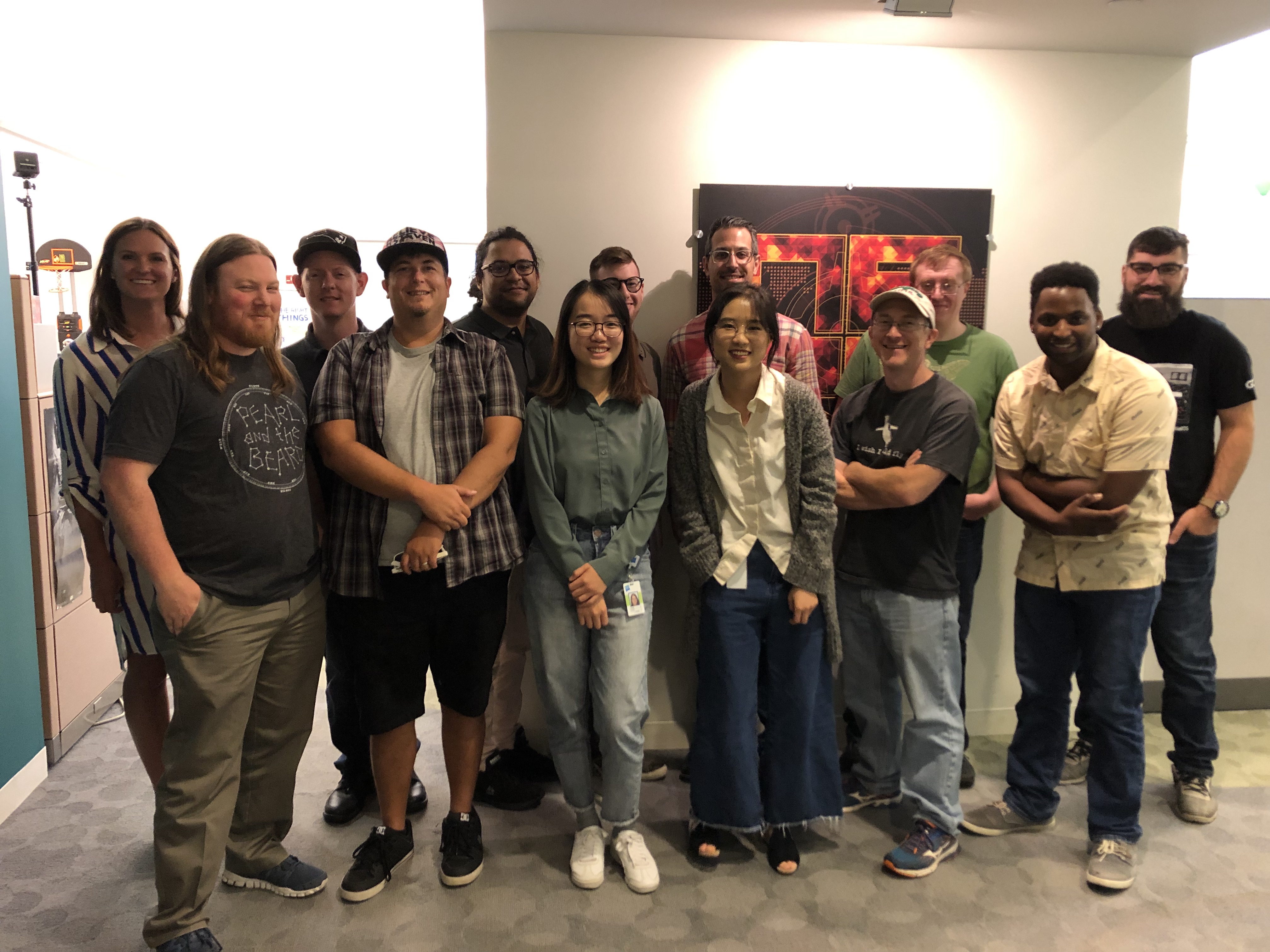
I worked on Digital Operations Team at Hasbro for 11 weeks (From May 2019 to August 2019) as a UX Design Intern.
As the only UX designer on the team, I was responsible for both user research and product design. I also collaborated very closely with a product manager, a scrum master, a visual designer (Icon + Motion Design), the development team, and other Brand Teams.
We followed an agile development approach to plan, develop, and ship our product.
My Contribution
I designed the end-to-end Hasbro Mobile Pulse experience from scratch and delivered the MVP version of the product to the development team by the end of my internship. The deliverables include key user flows, hi-fi interfaces, design spec documents, and interaction design samples.
The app will be ready for the Toy Fair in February 2020 for its initial release.

“ Where Fans Come First ”
What do we currently have?
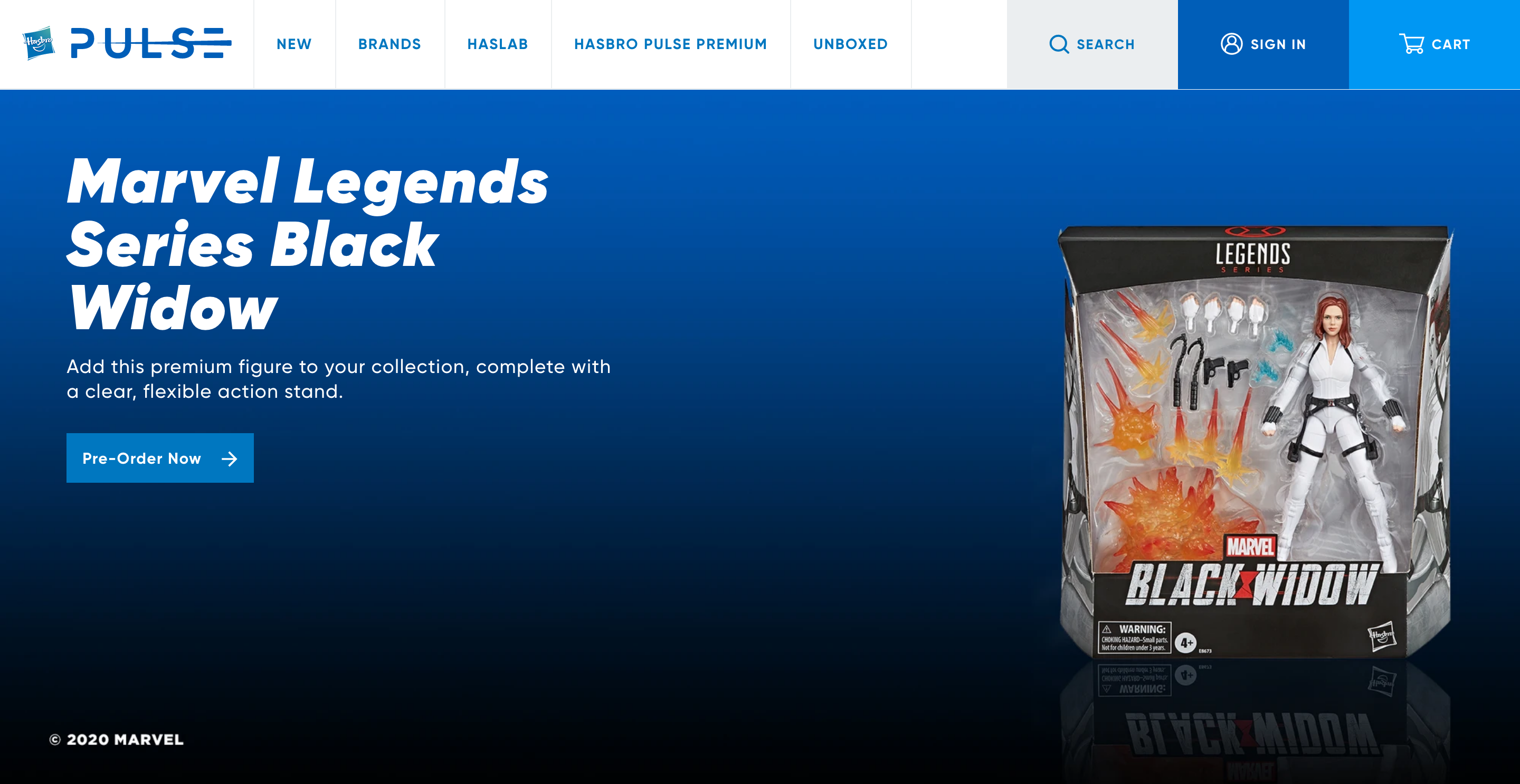
- Hasbro Pulse Website was relaunched in Feb 2019.
- The new site consolidates Hasbro Toy Shop, HasLab and Hasbro Pulse.
- Company's positioning of Hasbro Pulse Website is the ultimate fan destination for Hasbro’s portfolio of fan brands.
- People will find some of the best product offerings and experiences from the brands they love, a glimpse at more behind-the-scenes material and insider details that they can’t get anywhere else.
What problem we were facing?
“
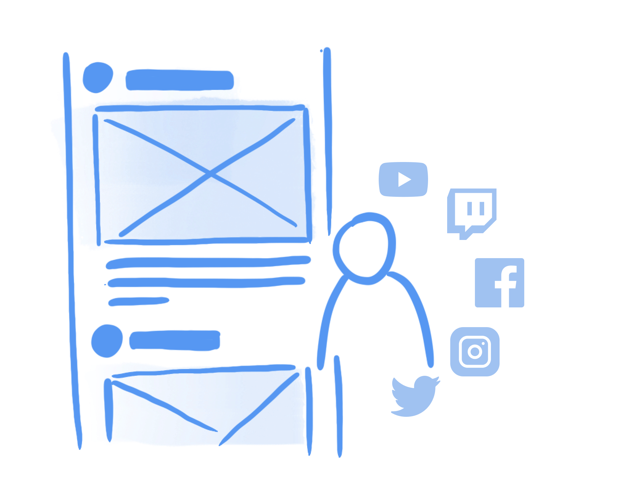
I get most of the toy information from social media, and Hasbro Pulse is usually just the place for me to make the purchase.
“
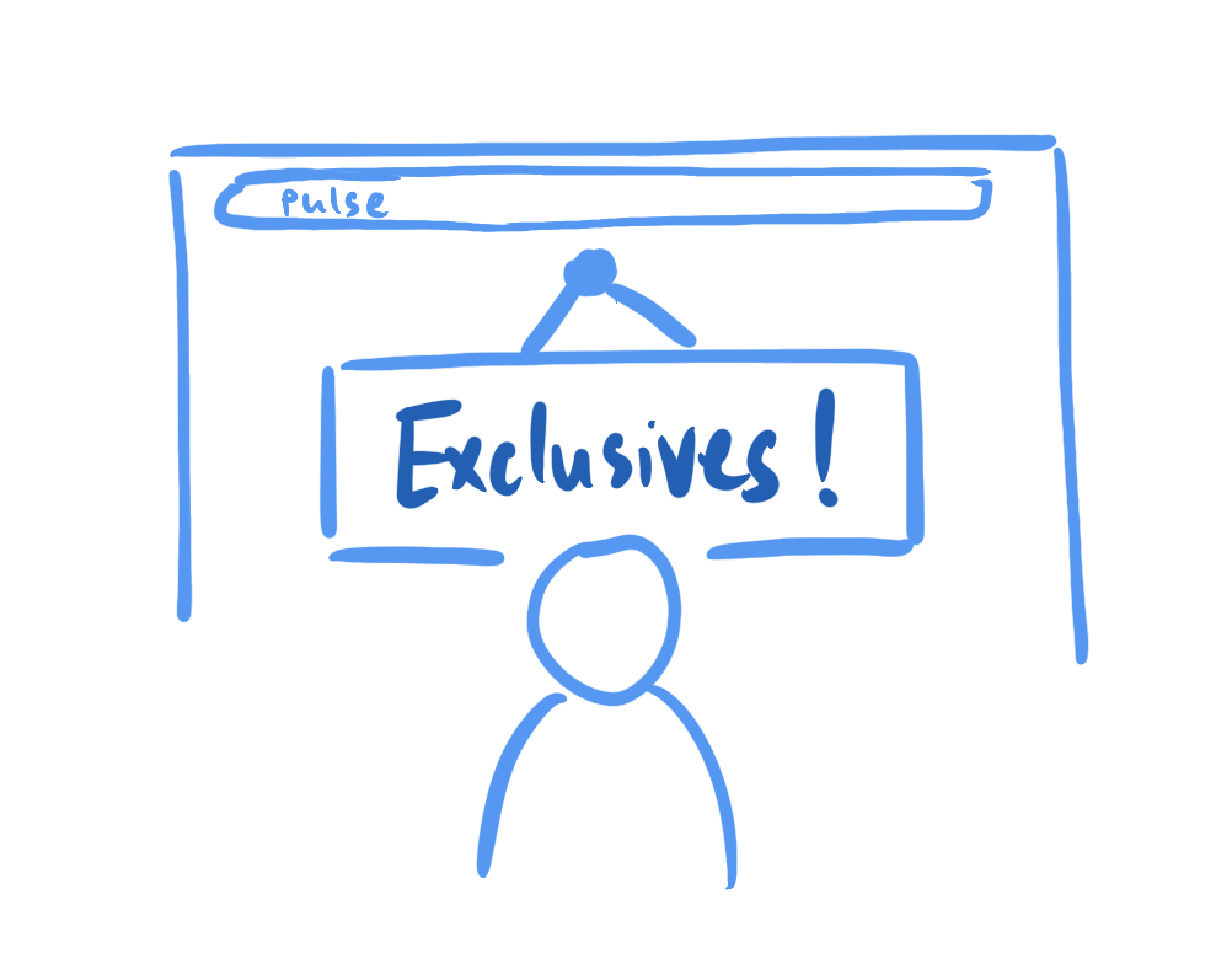
I only visit Pulse 3-4 times a year, usually after fan events like Comic-Con, Toy Fair… for exclusive products I cannot get elsewhere.
What strategies were applied in the design of Pulse Mobile App?
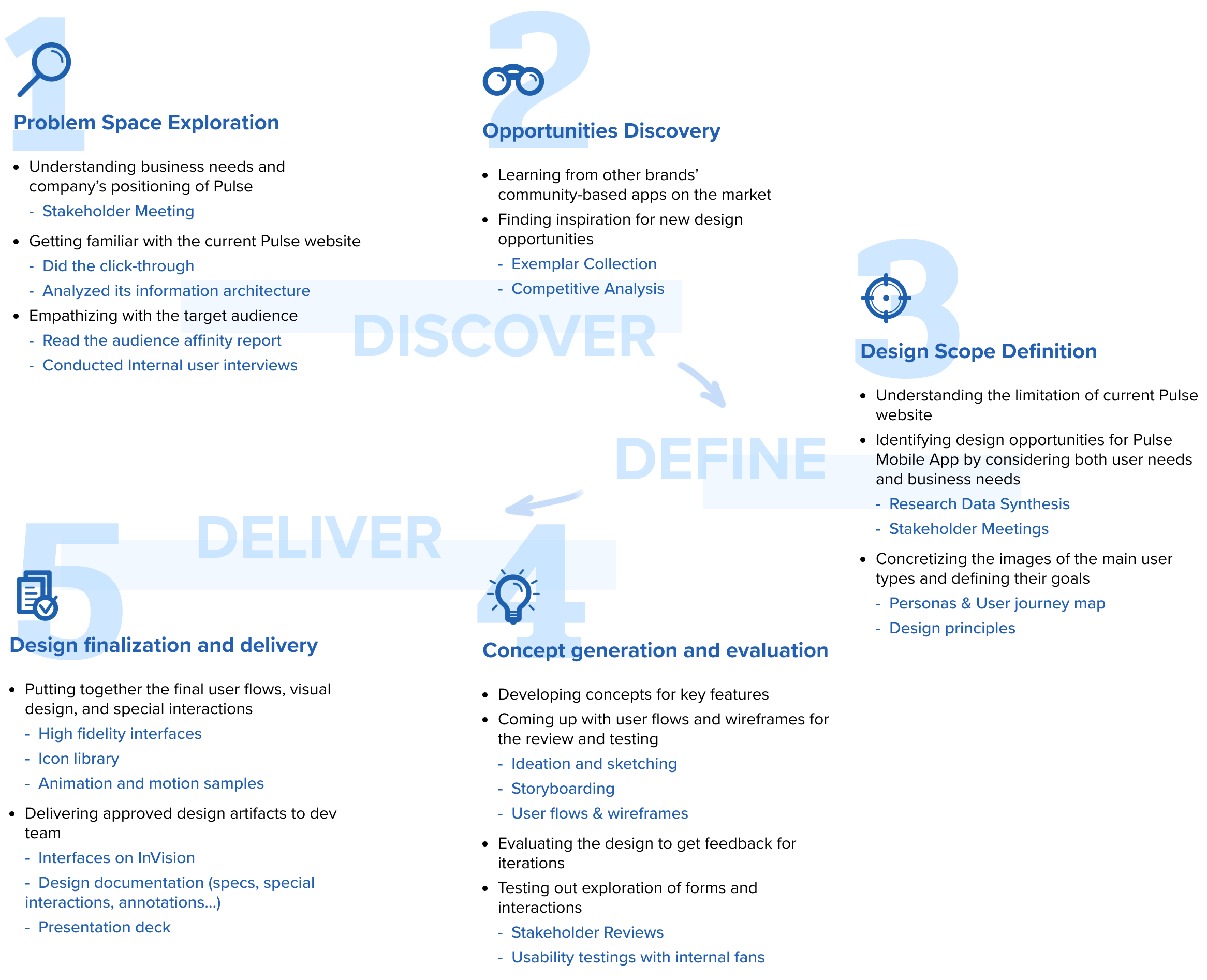
By participating in stakeholder meetings and conducting benchmarking and user interviews, I got to know more about the vision of the product, best practices on the market, and our fan’s expectations. Based on these insights from research activities, we defined the following three main strategies to guide the design of Pulse Mobile App. (Read more about my design process)
1
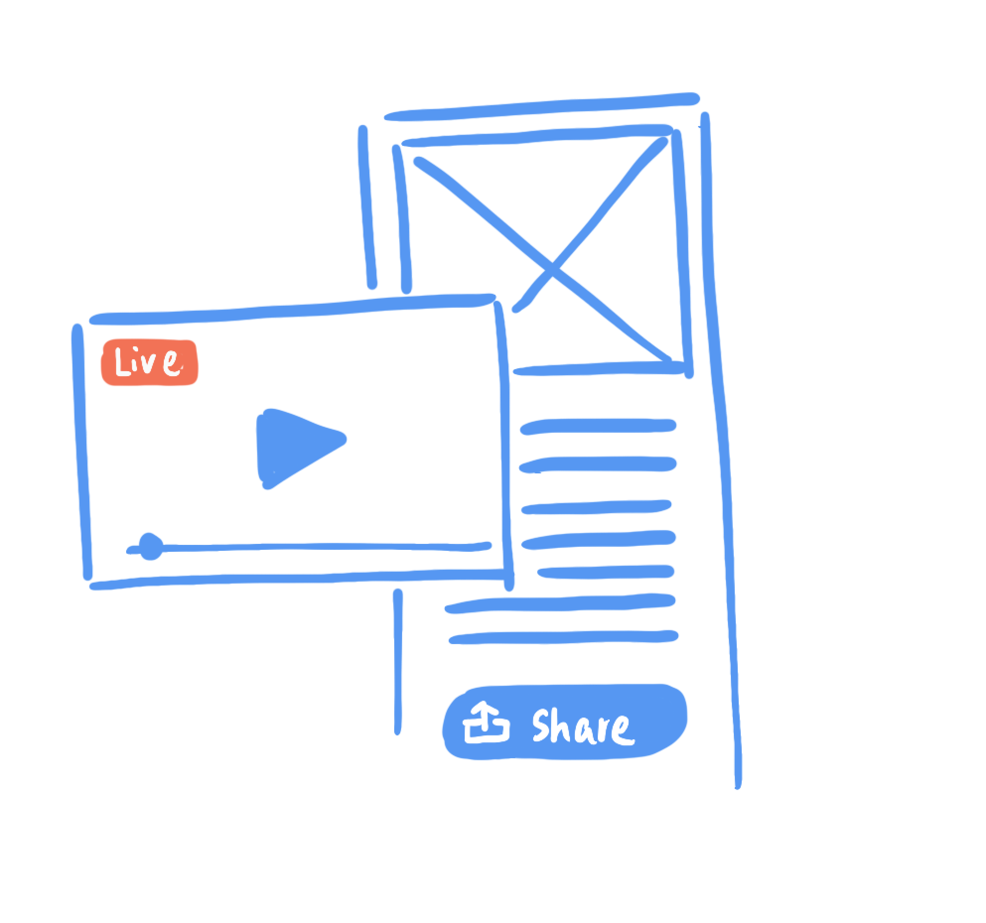
Enriching the content type - deliver "Content to Commerce"
2
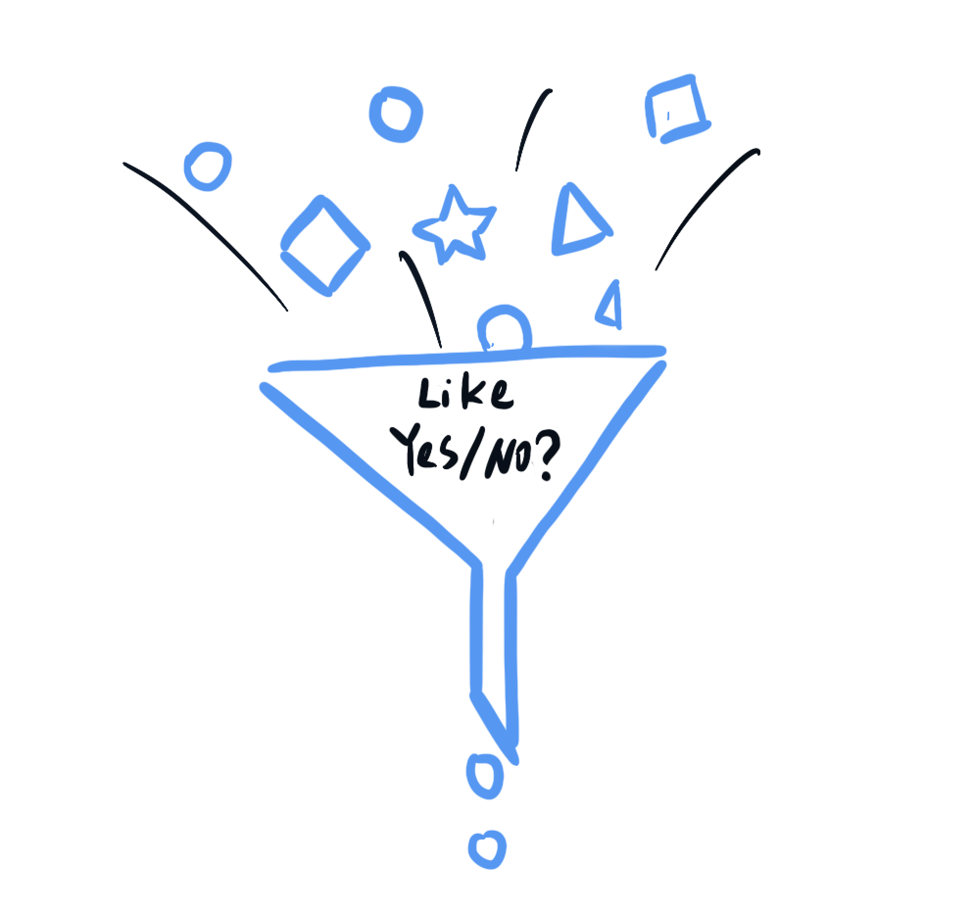
Curating the content presented to each individual
3
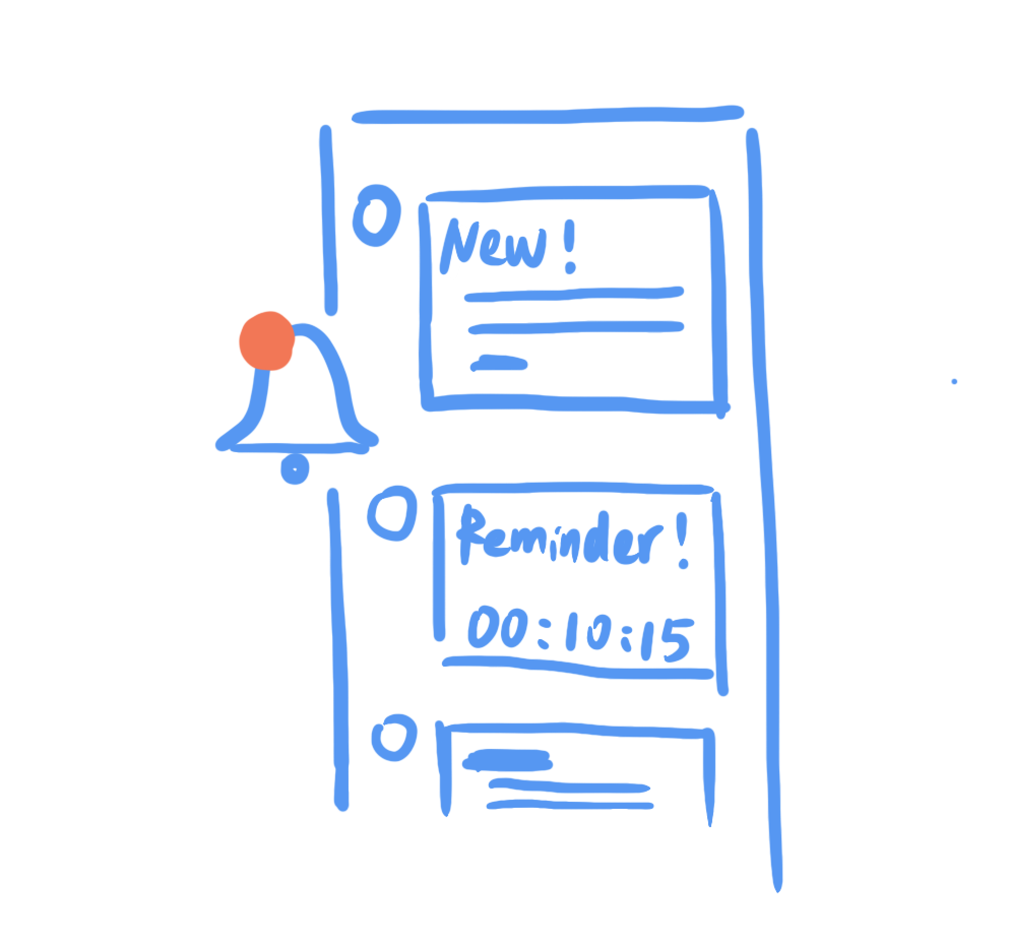
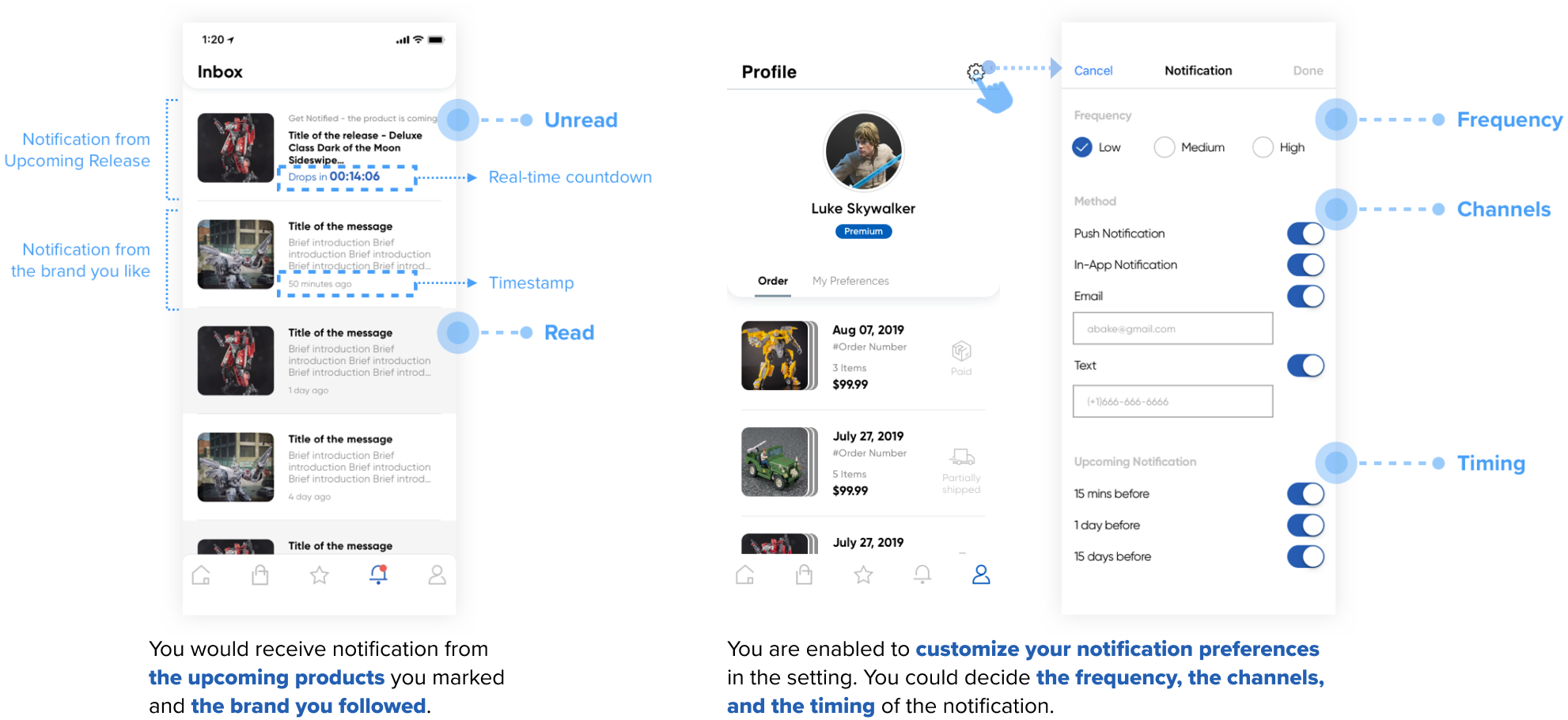
Notifying fans for the latest updates from the brands they like
What solution we came up with?
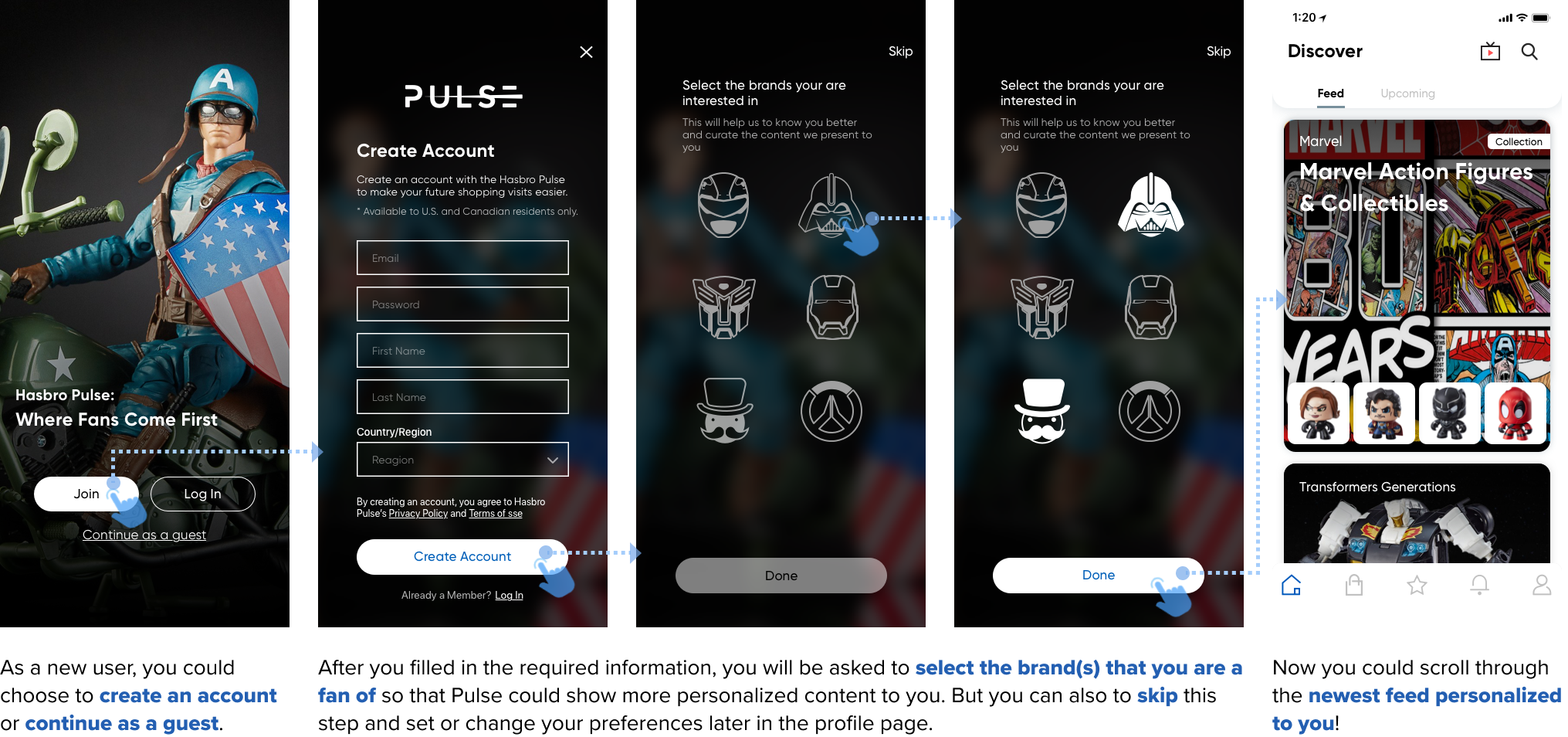
I accommodated the existing content and features from Pulse Website to the mobile app by following mobile interaction design principles.
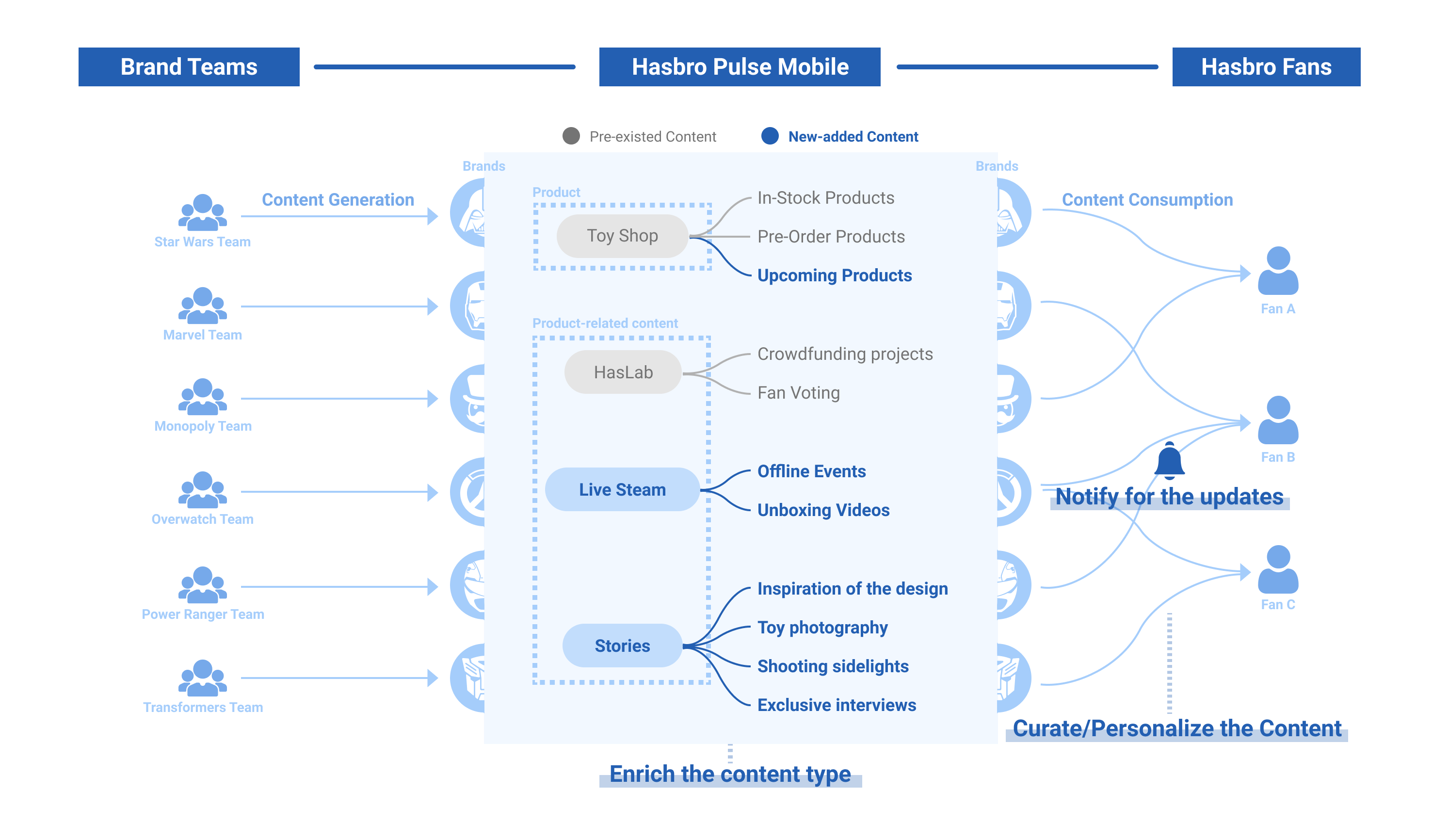
And also, by applying the three strategies we defined above, we complemented the Pulse Mobile with more enriching and engaging content types (like live stream videos, product-related stories...) to satisfy fan’s expectations.
The followings are some highlighted features on the app...
(Read more about the final design)
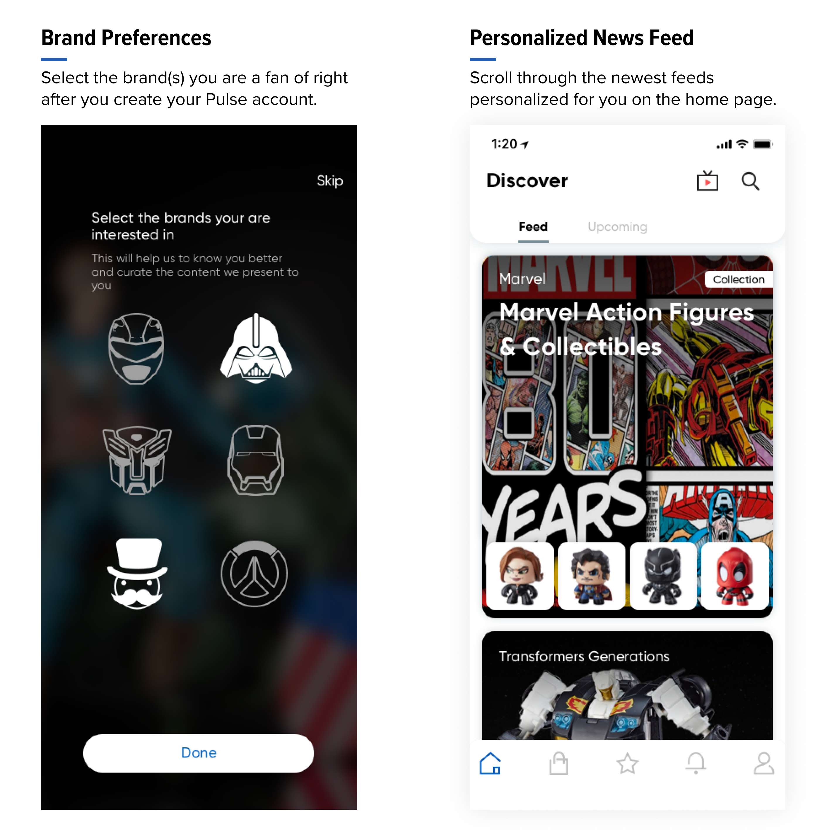
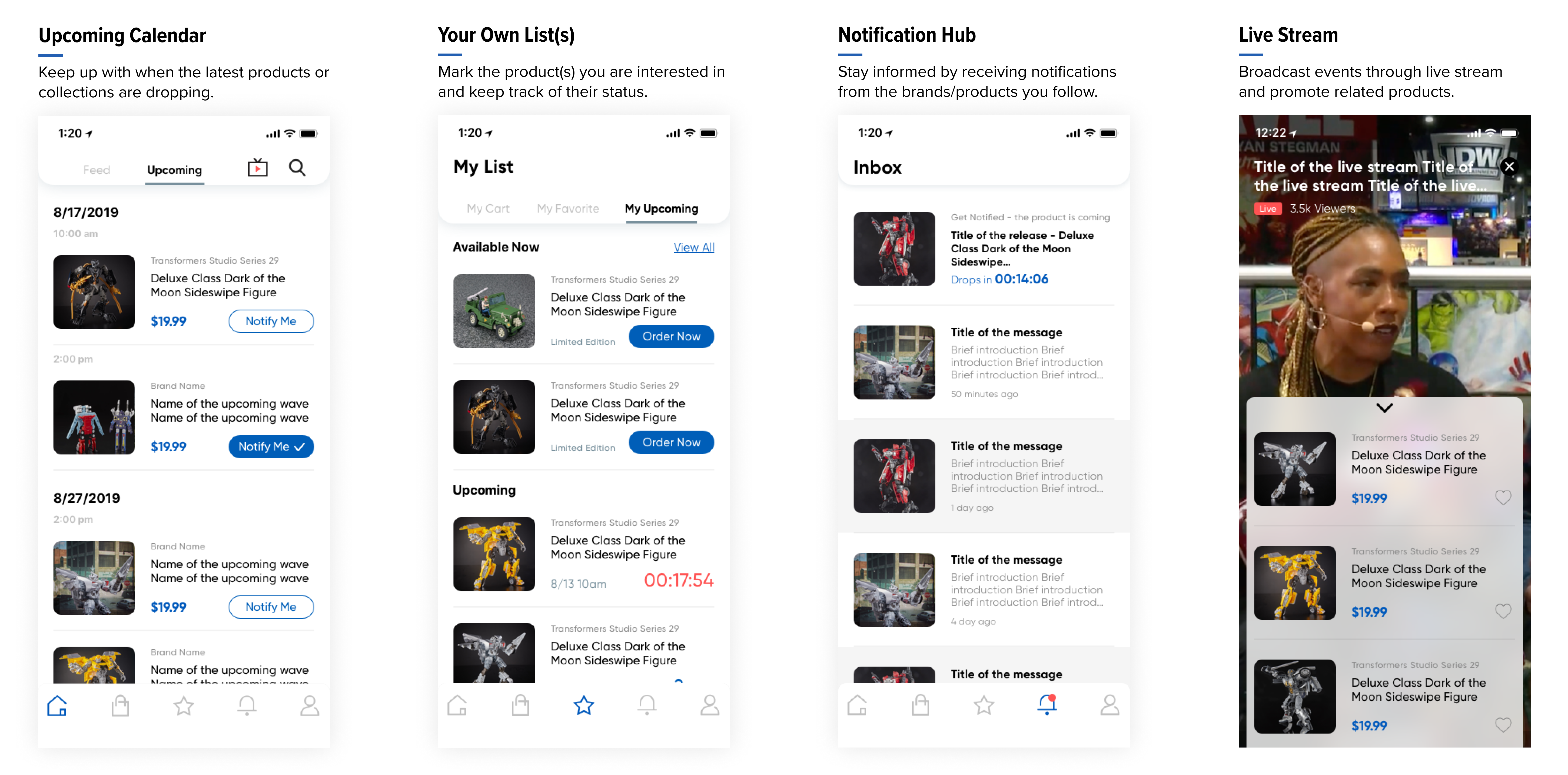
And since some of the new features were very content-driven, I communicated with different brand teams to see the content types that were currently available (on Pulse Website and on social medias) and their future plans for the content generation. Besides, I also generated templates for different content types to ensure consistency of the layouts on the platform.
What impacts the solution would bring?

Provide exclusive content fans cannot get anywhere else.
Enrich the content types on Pulse Mobile App by providing upcoming calendar, live stream feature, and behind-the-scene stories. Fans can get exclusive content they crave.
Improve the efficiency of getting relevant information.
Curate the information presented to different users according to their own preferences and providing them with the freedom to customize their notification settings.

Adopt new channel to increase fan engagement.
By taking the advantages of the mobile platform, fans could stay informed and keep track of the products/brands they are interested in by enabling in-app notification.

Process Overview
Problem Space Exploration
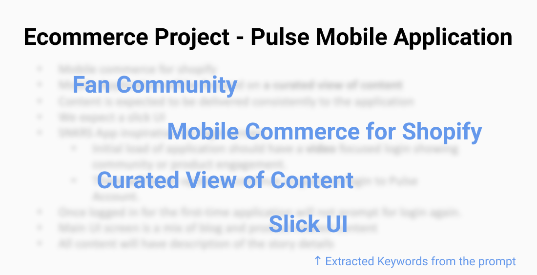
After I got the prompt of the project from my manager, I asked the following questions to guide my design process.
- What does a good fan community entail?
- What is missing from the current Pulse experience?
- How can we satisfy fans' expectation on Pulse community?

I expected to have a better understanding on the company’s vision of Pulse Mobile App by talking to product management team and other brand teams.
And I was also trying to figure out the following questions:
- What are the metrics we will use to measure the success of a fan community?
- What are the resources we could utilize in order to build a better fan community?

I conducted competitive research by analyzing 7 other brands’ mobile applications, with the aim to...
- Figure out how other brands define their own fan communities;
- Explore other brands’ strategies of crafting an engaging fan community experience for their loyal customers;
- Get some inspirations for the design of Pulse Mobile App.

In order to get familiar with fan’s behavior and mental model, I conducted 1-on-1 semi-structured interviews with 7 members from the internal fan community. The questions were mainly focus on these two aspects:
- Fan’s current sources of information – where do they get the latest news from the brand they like?
- Fan’s impression on Pulse website – how do they think about the Pulse website?
Key Insights from Research
Based on the discussion with stakeholders in the internal meeting, we all believed that a successful fan community would be a place where fans are willing to spend more time.
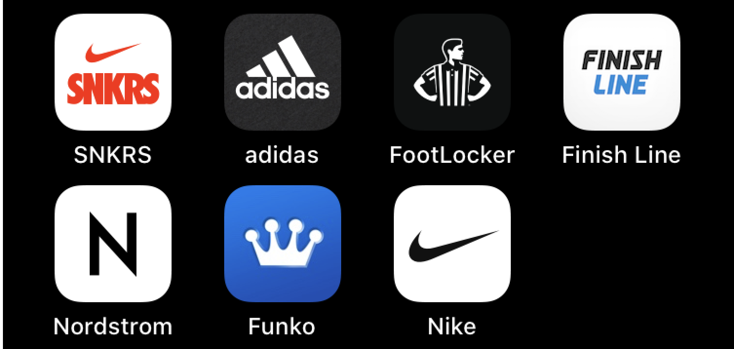
And also, by analyzing the features and contents of other brand apps on the market, I discovered a general pattern of constituting a good fan community – it should...
- Provide users with appealing content - Attracting
- Enable users to find the information they need and get the tasks done with no extra efforts - Retaining
- Utilize the social interaction to connect people with same interests together - Sharing
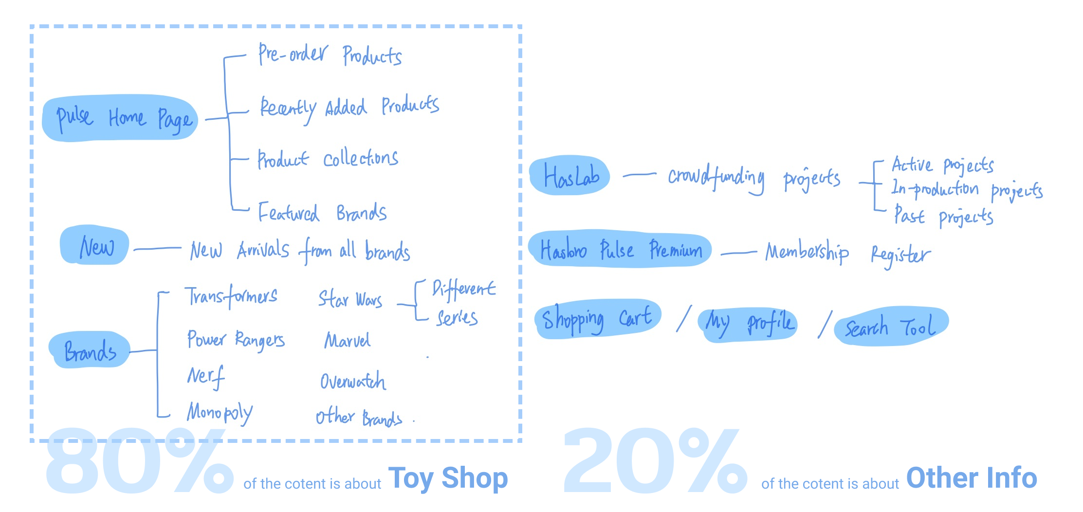
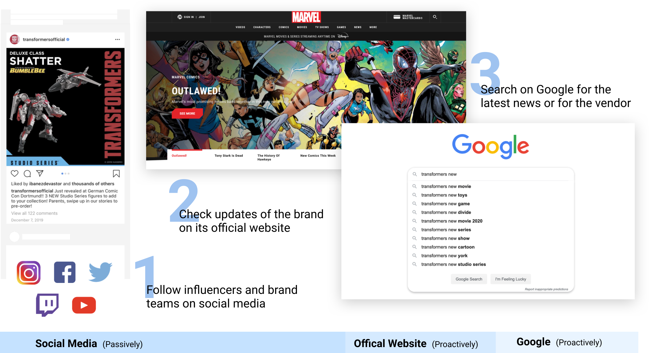
Information is now scattered everywhere
From the interviews, I found that currently the main source of information for fans was social media. They followed influencers and brand teams on Twitter, Instagram, Facebook, YouTube, or Twitch. Useful information from the brands they like is now scattered everywhere.
Passive information acquisition is not efficient
Although fans could passively receive the updates from the brands they like by browsing the posts on social media, they still might lose track of or miss some important news. It’s not efficient for them to get brand-related information among all other news feeds.
The promotion and the sales are seperate
Once fans get the information about the upcoming releases, they still need to navigate around to find the way of the purchase – offline toy stations or stores, or online toy shops. Currently, the promotion of the new product and the sales of it are separate.
By talking to Hasbro fans from internal fan community, I defined two main types of users based on how passionate they are about the brand they follow. And I also discovered some differences between the behavioral patterns and the goals of these two types of people.

- Keep Updated with the latest news
- Keep track of the collectibles he wants
- Get exclusives before they are gone
- Research collectibles
- Research collectibles
- Keep track of the collectibles she wants
- Keep Updated with the latest news
By being aware of fan’s current pain points and expectations, taking the resources that are available into consideration, and taking the advantages of the mobile platform, we defined the following three main strategies to guide the design of Pulse Mobile App.
1
Enriching the content type - deliver "Content to Commerce"
2
Curating the content presented to each individual
3
Notifying fans for the latest updates from the brands they like
Low-Fi Prototype & Usability Testing
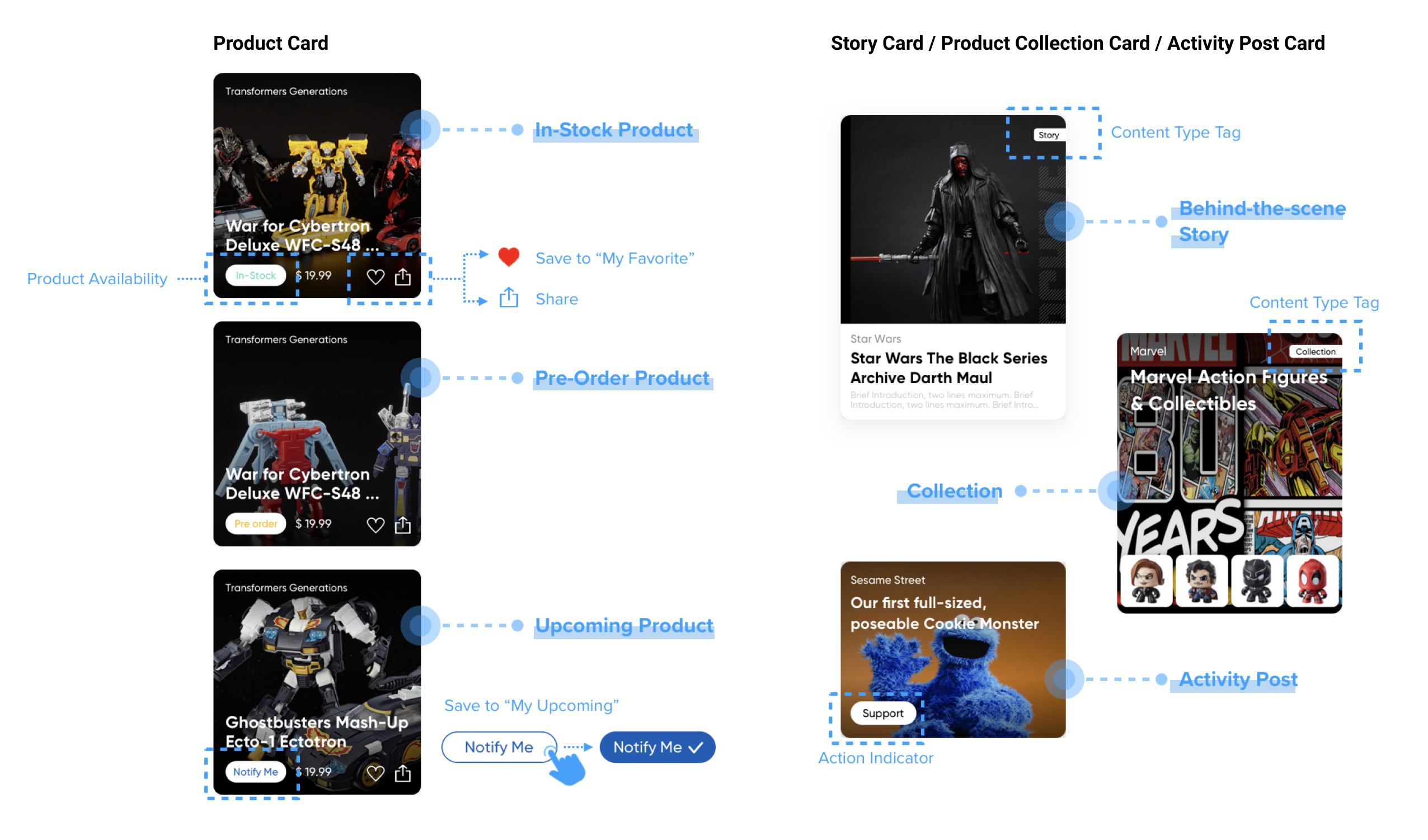
Based on the strategy of “enriching the content type”, there are going to be 6 different types of content on the home feed page – In-Stock Products, Pre-Order Products, Upcoming Products, Product Collection, Story, and Event Post.
We want our fans to distinguish different content types at the first glance, and also, be able to take some quick actions without clicking into the detail page.
Keywords: Distinguishable, Shareable
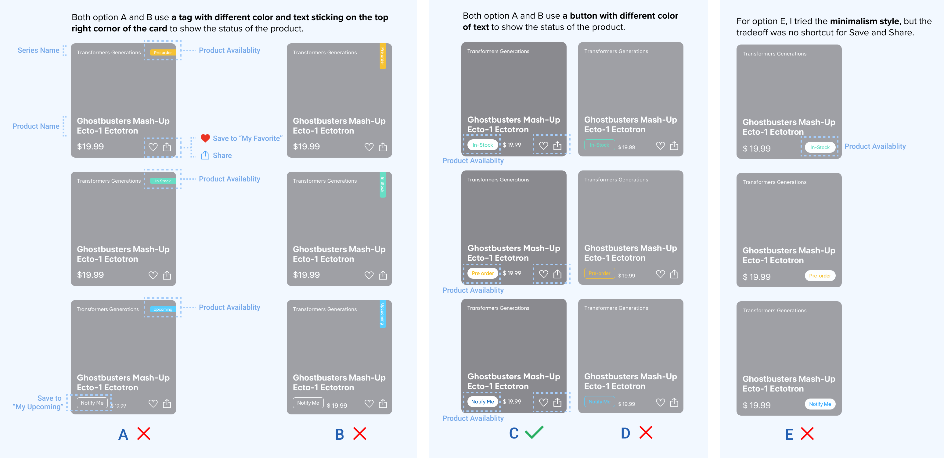
The above five options of the Product Card were presented to other members on the internal meeting. Based on the readability of the product availability status and the consistency among cards for different content types, we decided to choose option C. And the final design of cards for different content types are shown as below.
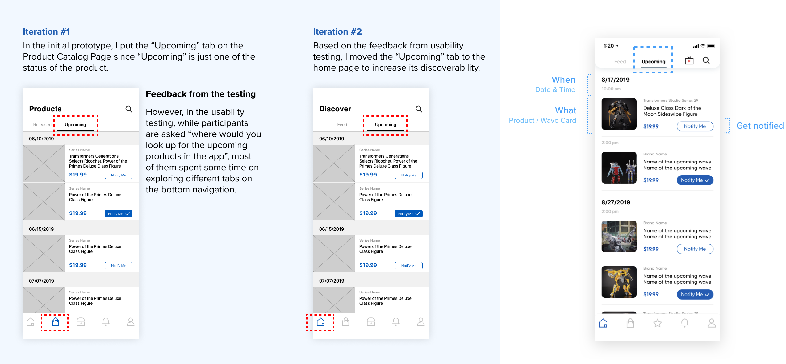
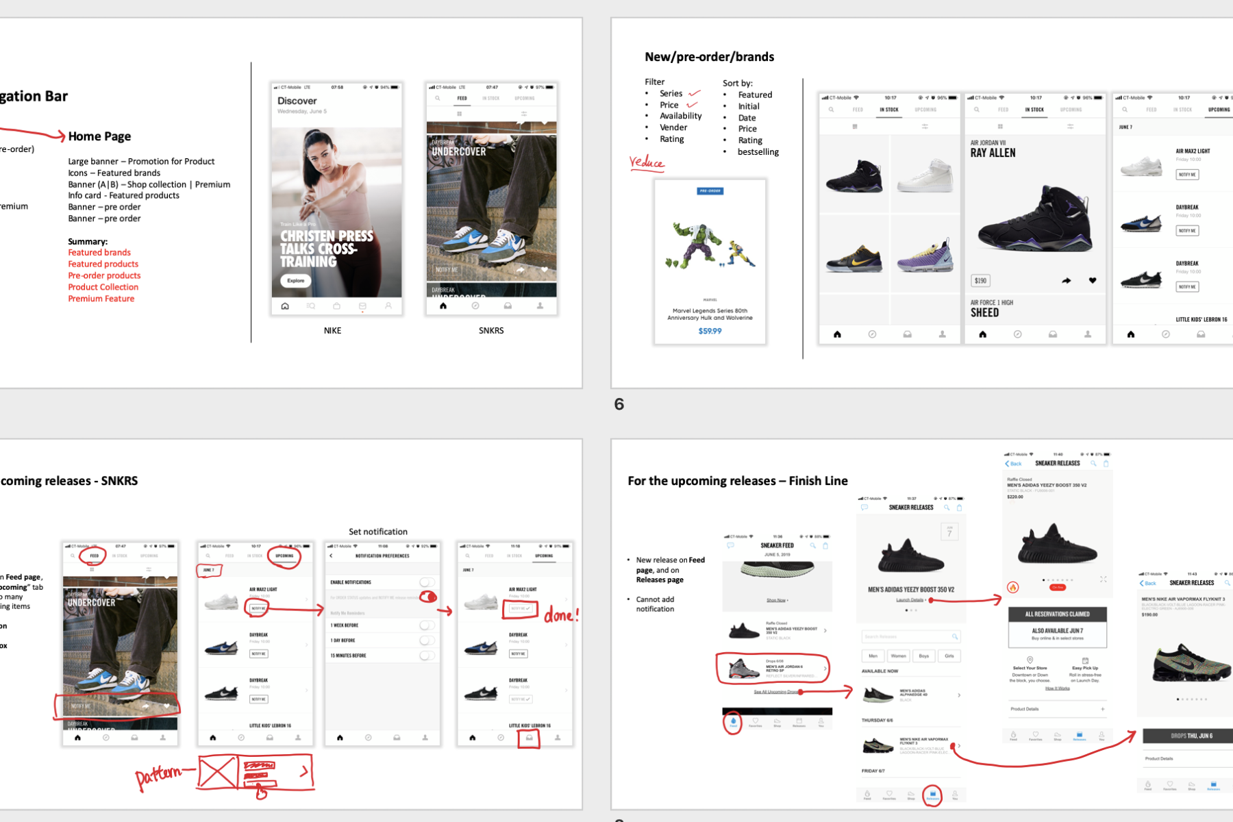
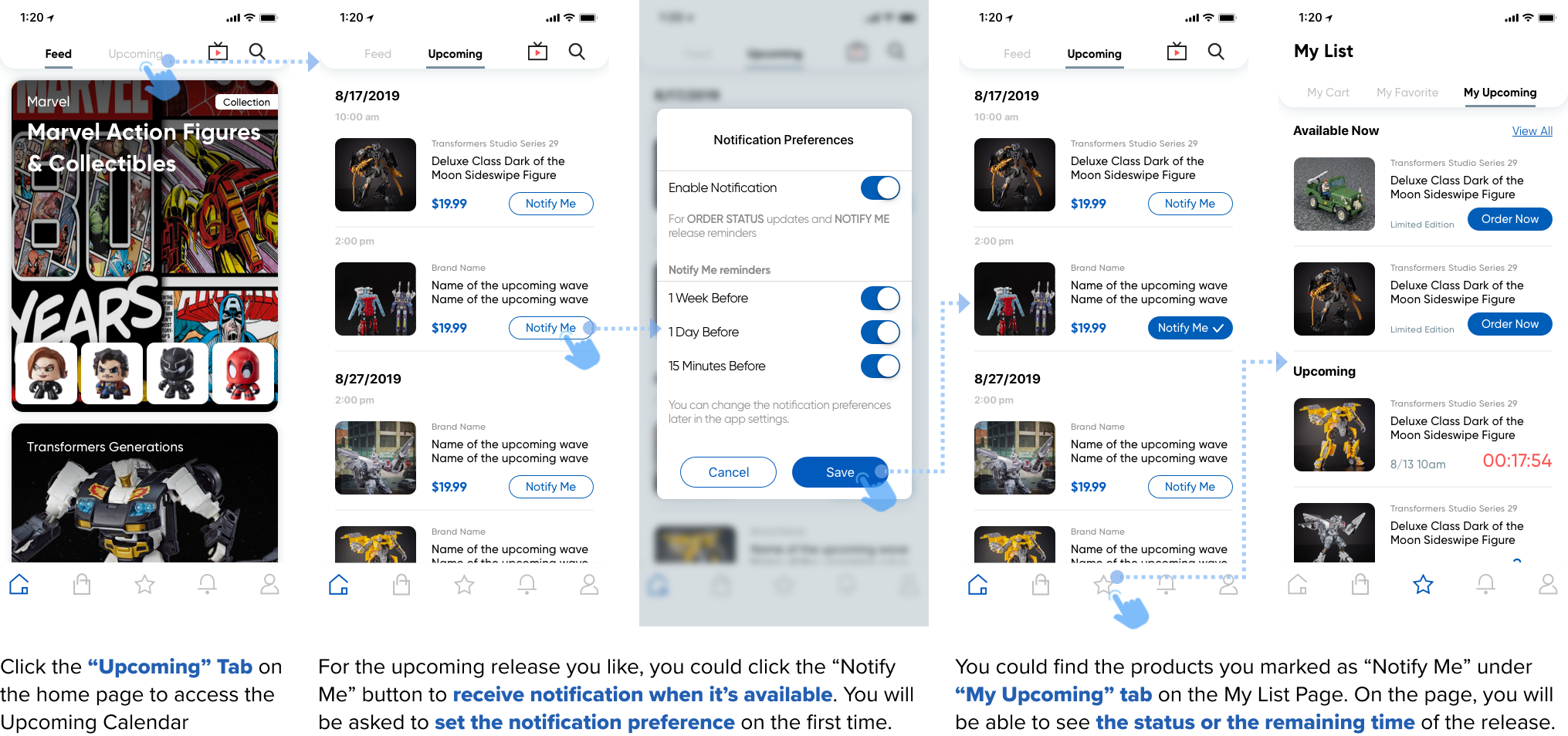
The Upcoming Calendar is a newly-added feature on the Pulse Mobile App. Fans will be able to know when the latest Products or Product Collections are dropping so that they could be both mentally and financially prepared.
We view Upcoming Calendar as an important feature that could attract fans to come back constantly, so we want to put it at a visible location in the app.
Keywords: Discoverability
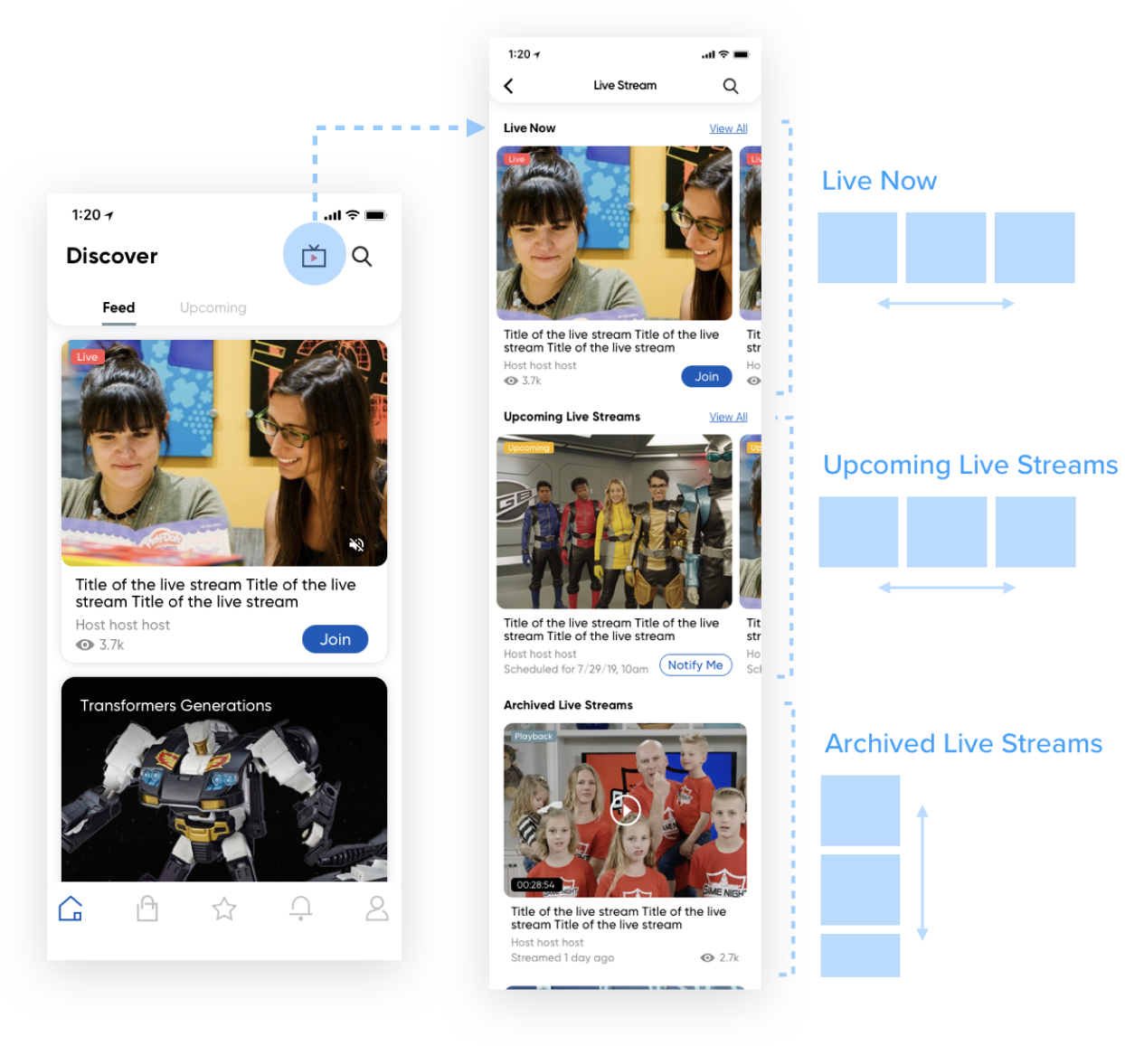
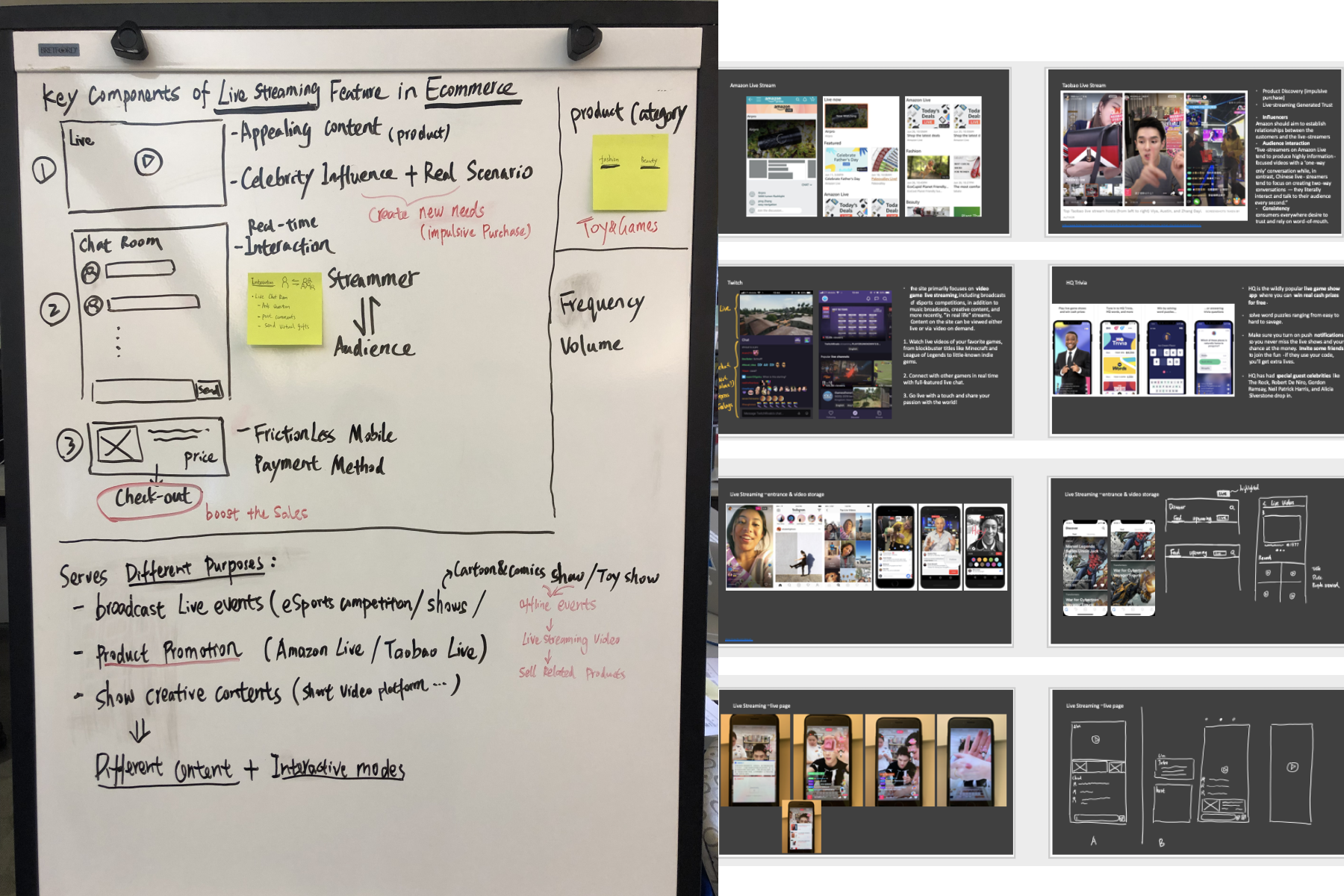
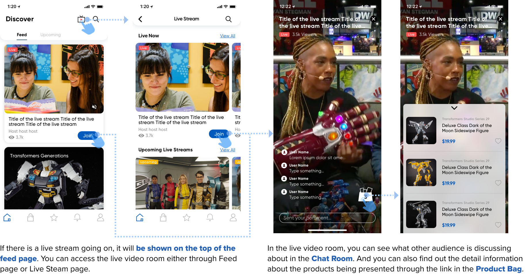
Live Stream is also a new feature we added in Pulse Mobile App to enrich the content type and increase fan engagement.
However, since there aren't many live stream events happening currently, this is more like a feature designed for the near future. From the stakeholder meeting, I learned that the company would increase the number and frequency of the Live Steam events gradually. So, I needed to design based on the current situation but also take the future needs into consideration.
I explored the ways how users can access the live stream feature and narrowed to the following two options. I tested both of the options in the usability testing.
Keywords: Discoverability, Intuitiveness
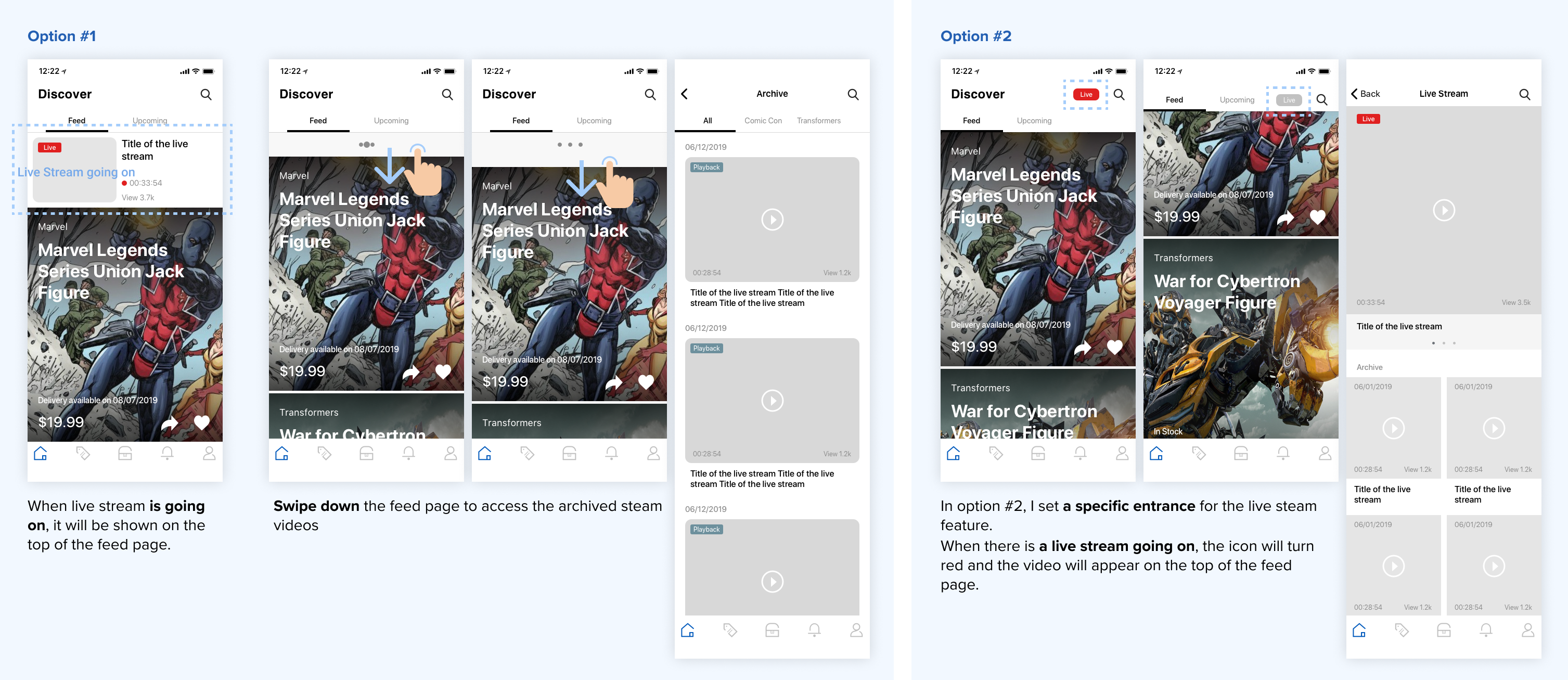
From usability testing, I found most of the participants were unaware of the hidden trigger to open the Live Steam page through swiping down.
By considering the discoverability and the intuitiveness of the Live Stream feature, we decided to set a specific entrance for it. And I also designed the Live Stream page by considering the large volume of archived videos in the future.
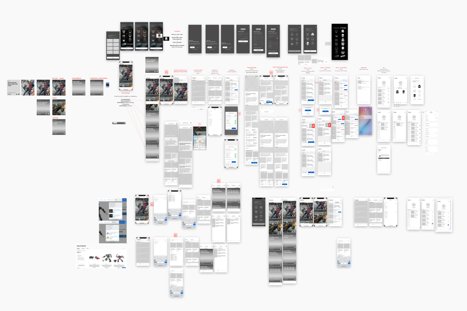
Process Documentations and Photos
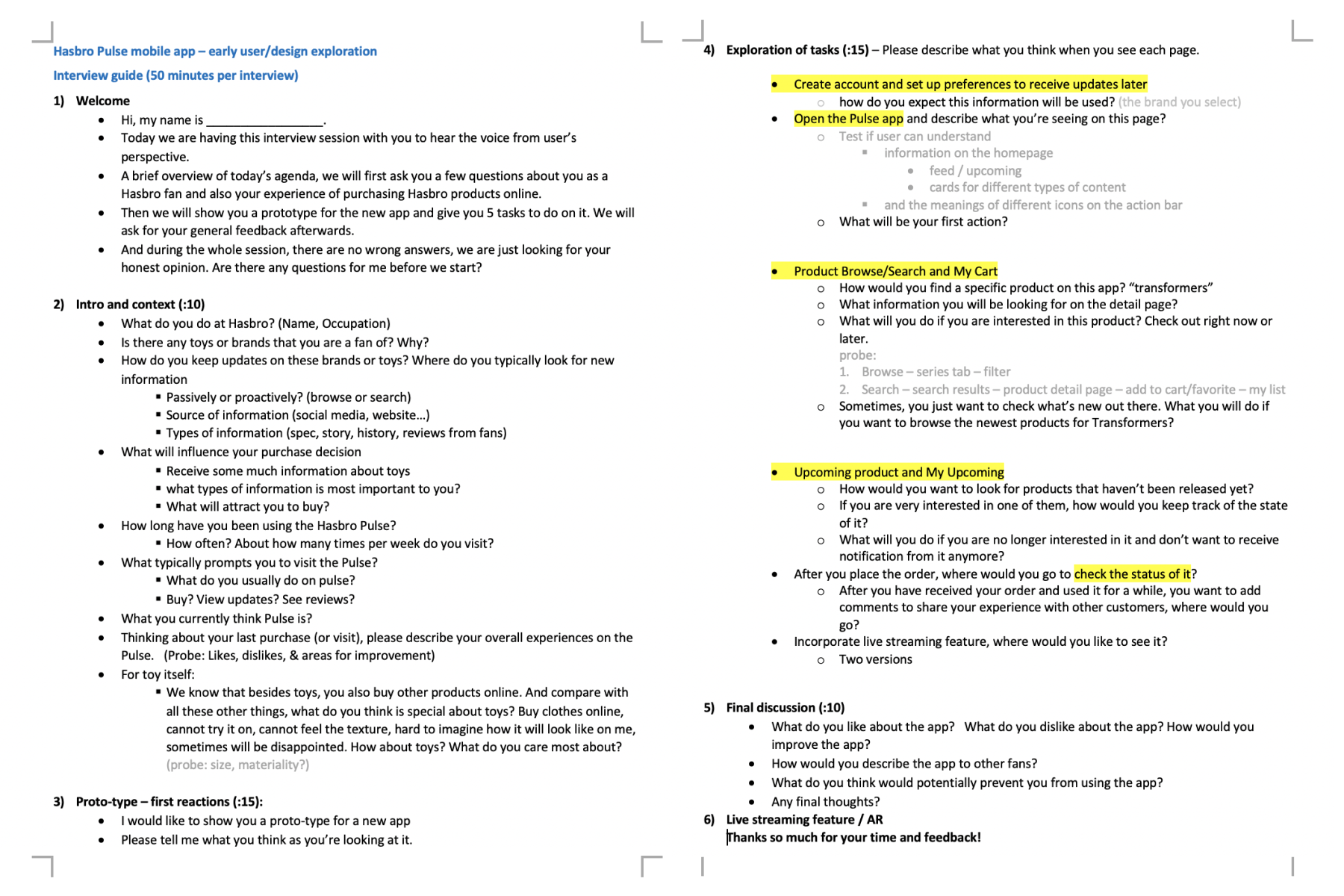
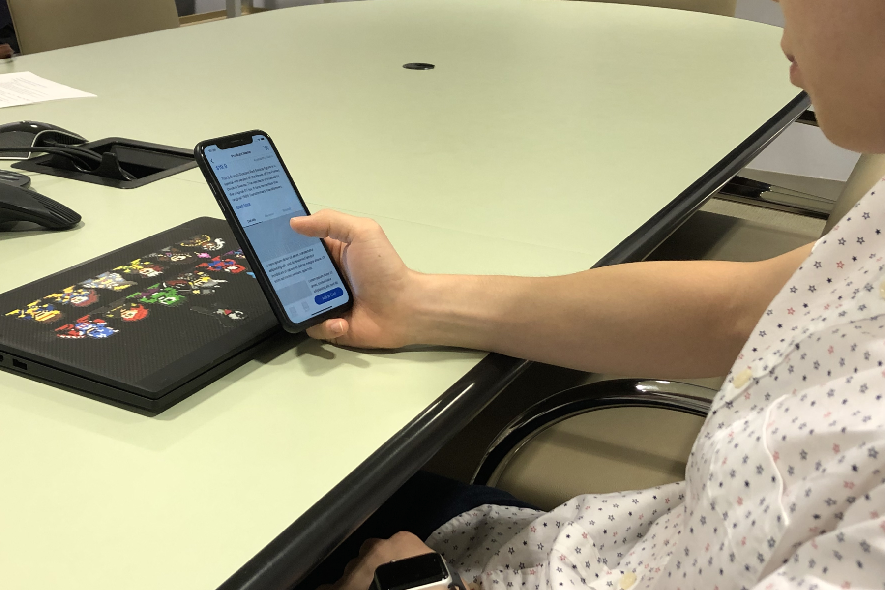
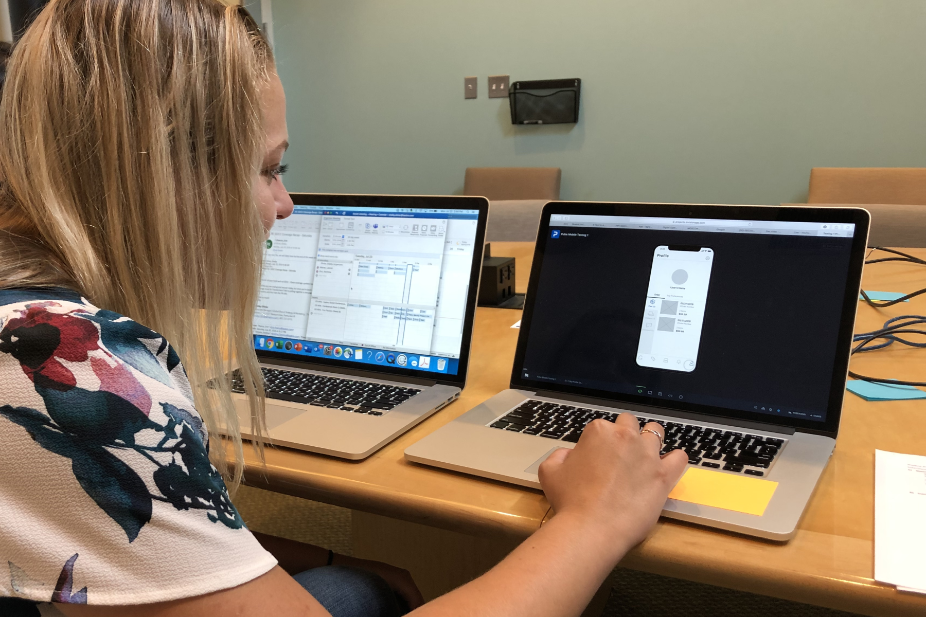
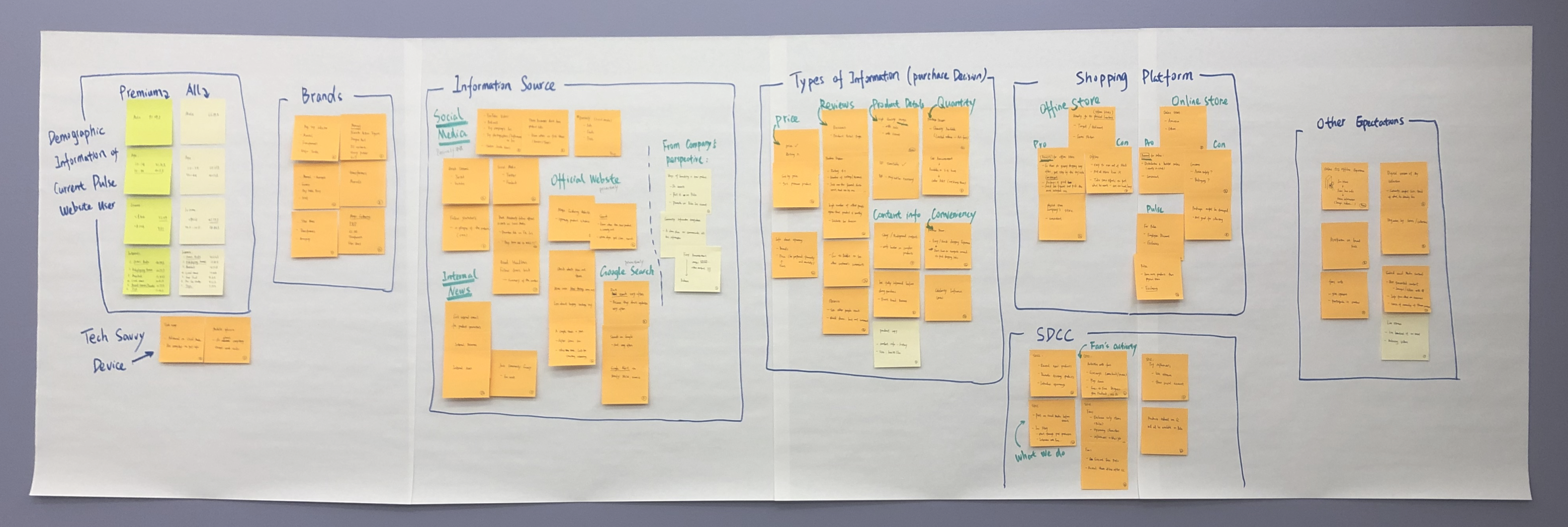
1. Understanding the strategic planning of the product helps to determine the right direction to go in design.
During the internship, I was constantly getting requirements or feedback from senior management team about how they wanted Pulse Mobile App to be. And as the only UX designer on the team, I needed to figure out how to transfer the vision of the product into actionable design decisions. By looking at competitive products and talking to potential users, I felt I was able to see through the mist and came up with ideas about how the product could be.
But as I was getting more information from the research, I felt the necessity to take a step back and see the problem I was tackling with from a holistic view before diving into the detail. I tried to learn more about the strategic planning for the Pulse Mobile from the meetings with stakeholders and the discussions with my manager. This further understanding helped me to be more confident while prioritizing the information I got from research and narrowing down the design scope at the current stage.
2. Design is not just about taking actions for the moment, but also about envisioning the future and paving the way in between.
As we were envisioning the future by discussing about how this mobile platform could be utilized to further expand the e-commerce capabilities and talking about some big goals we wanted to achieve in the near future, we also saw the big gap between the ideal and reality.
Since the whole app was very content-driven, I looked at the types of the information on the current Pulse website and talked to different brand teams about their existing resources –it’s of vital importance for me to learn about what we currently have while designing for the MVP version of the product. However, the future of the product shouldn’t be restricted by the reality. Instead, the design should also reflect the envisioning of how we want this product to be and how we can get there progressively by following a sequence of actions. Along the way, we will be building, testing, and revising, but we will always be moving towards the goal of making Pulse a better fan community.